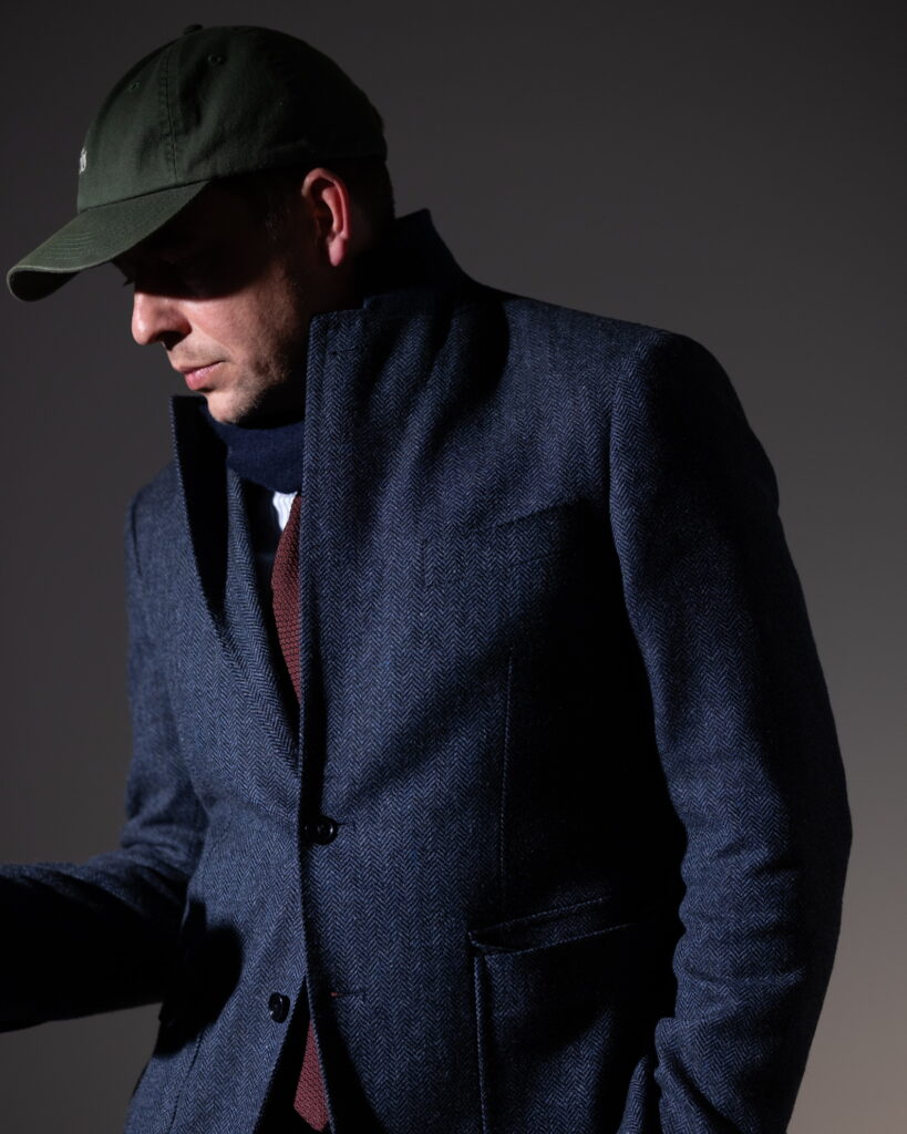
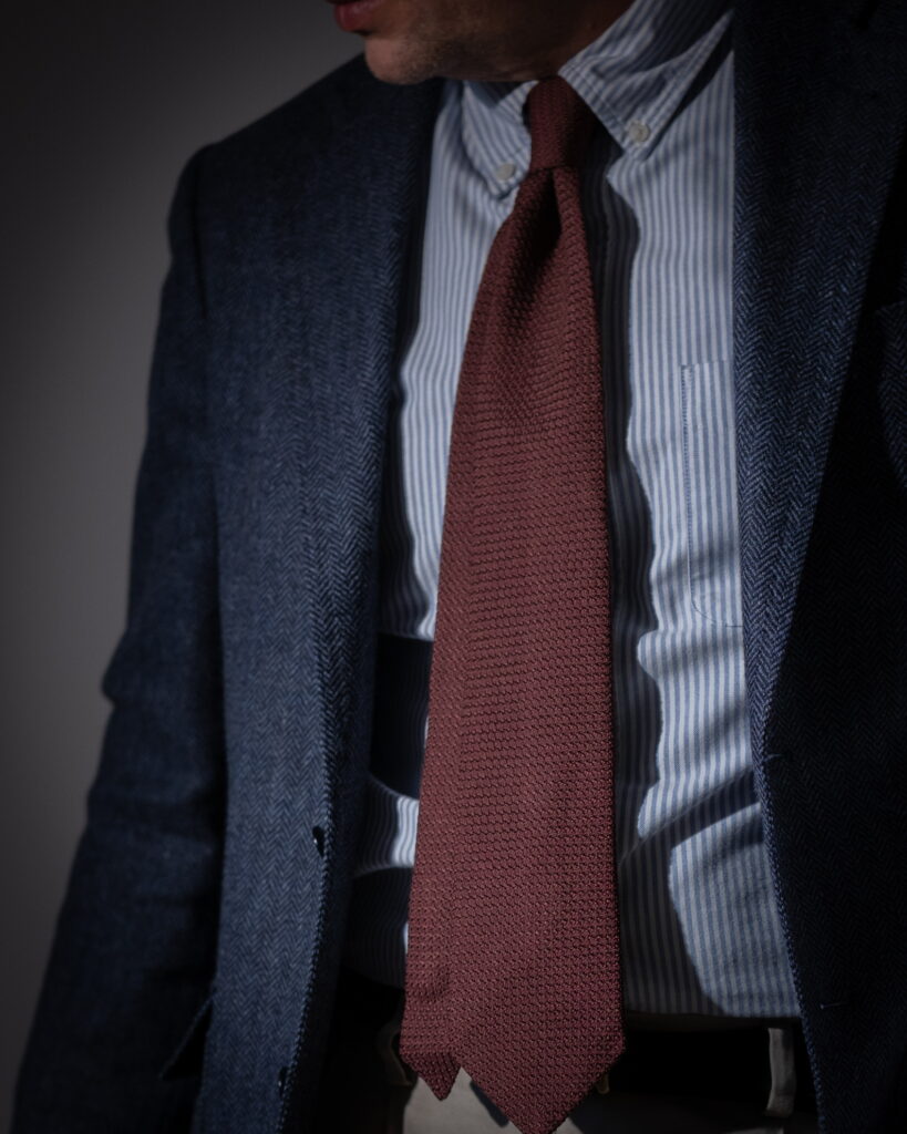
The palette is tightly controlled: deep navy, muted burgundy, and warm beige. The shirt introduces a cooler blue-white stripe, increasing brightness without disrupting the tonal cohesion. Overall contrast remains moderate, but is intensified locally through texture rather than colour.
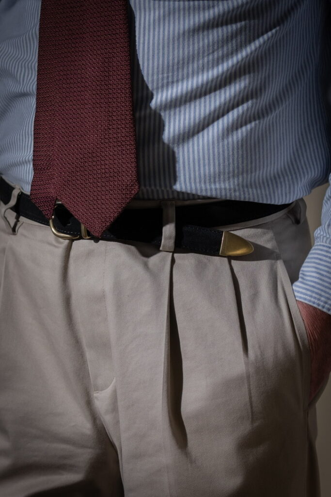
The central element is the tie—grenadine in a burgundy tone. Its open weave creates a granular surface that breaks light into micro-shadow. Unlike smooth silk, it avoids flat reflection. The result is depth without gloss, a surface that appears almost porous.
Kreide auf rauem Stoff
The blazer, in a navy herringbone wool, operates differently. Its pattern emerges only under light, with the chevron structure catching highlights intermittently. This creates a restrained, rhythmic texture—less active than the tie, but more structured.
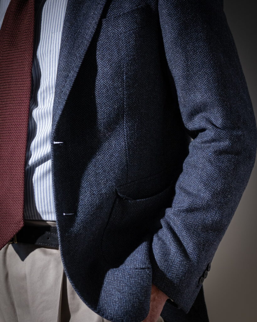
The shirt, a striped cotton, reflects light more directly. The vertical lines introduce optical rhythm and increase perceived sharpness. However, the weave remains dry, preventing excessive brightness.
The trousers, in beige cotton, provide a stable base. Their surface reflects softly, with enough structure to hold crease definition. The pleats create controlled shadow zones, reinforcing volume without adding contrast.
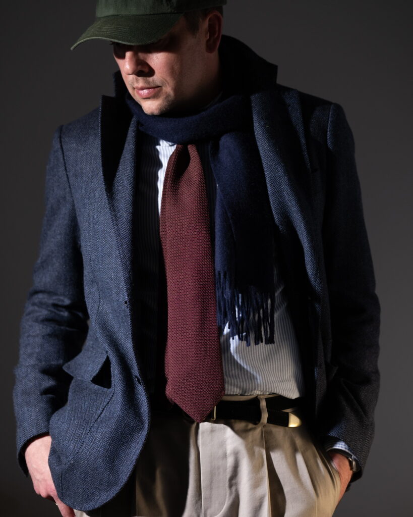
The scarf introduces an additional absorptive layer. Dark and dense, it reduces the overall reflectivity of the upper composition, framing the tie and limiting visual dispersion.
Stylistically, the system aligns with classic tailoring but shifts through material emphasis. The grenadine tie—historically formal—becomes the most texturally active element. The rest of the outfit supports it through restraint.