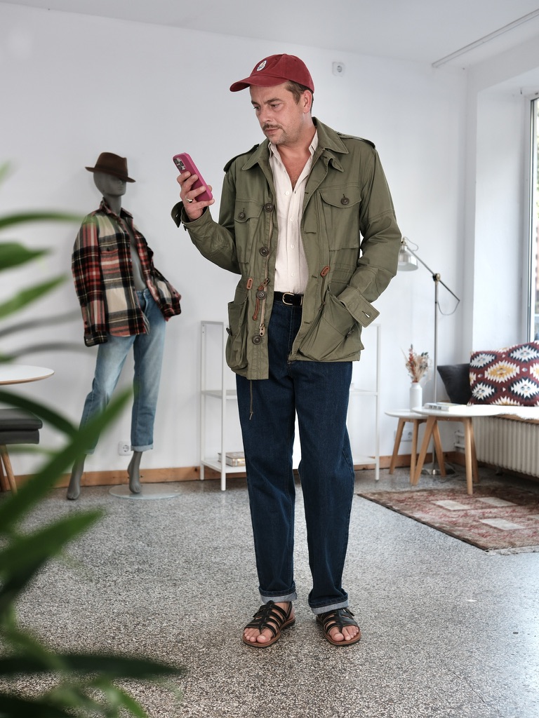
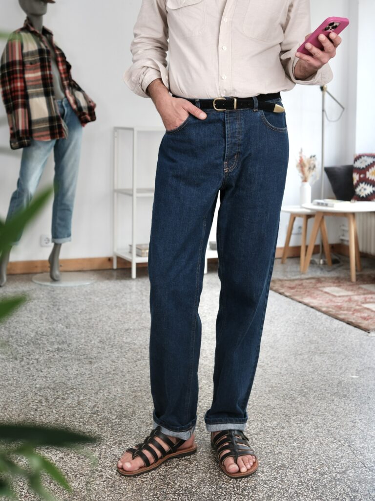
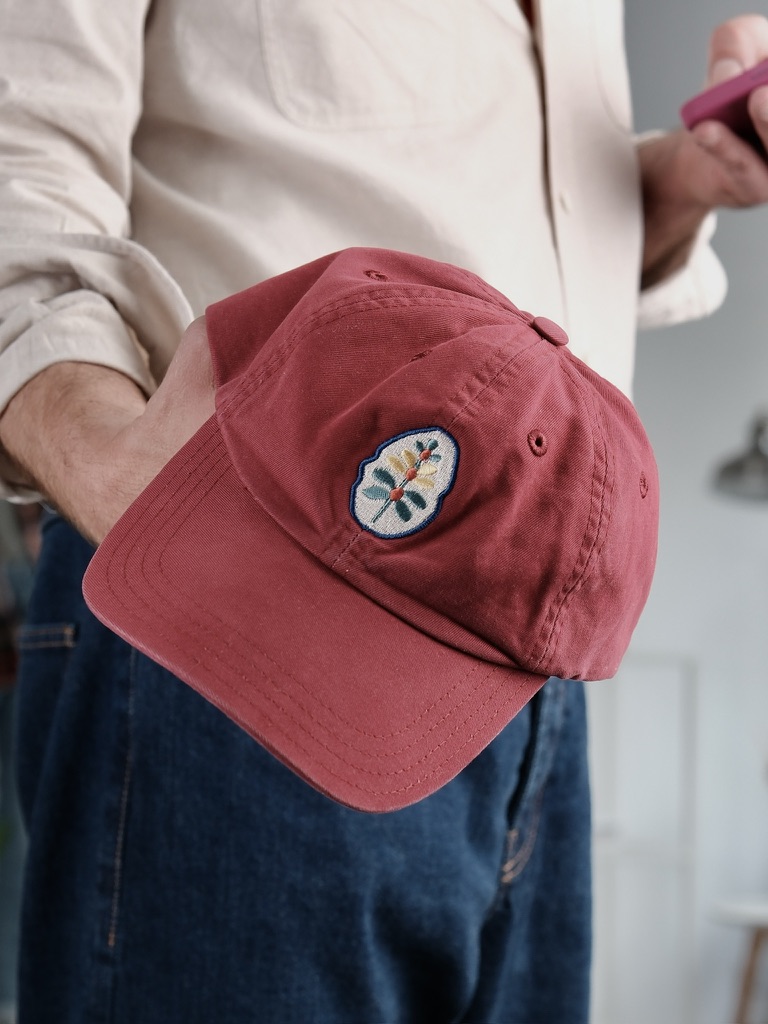
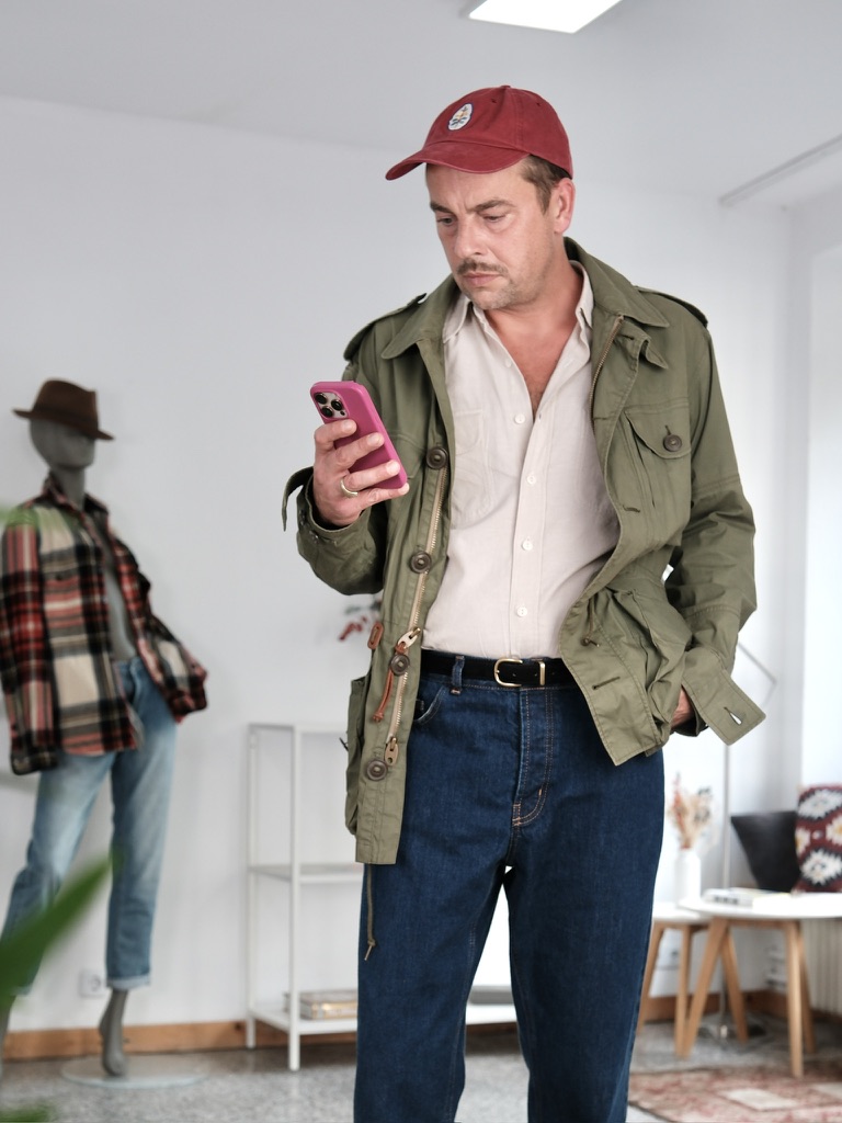
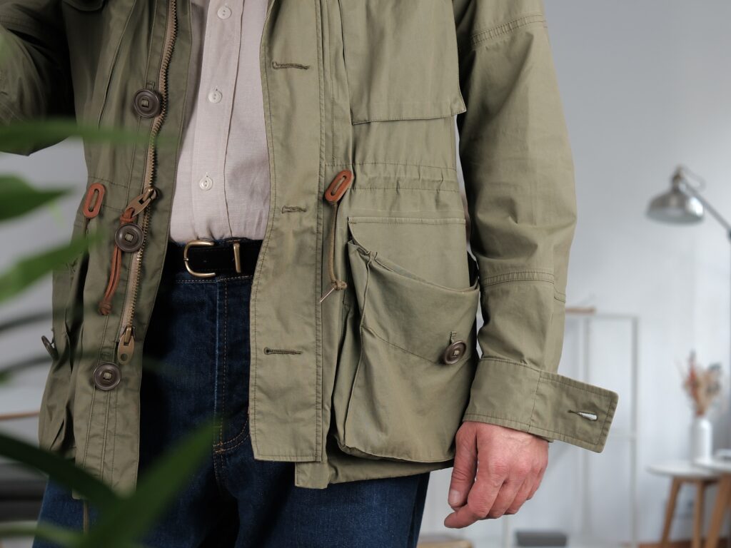
Olive field jacket, ecru shirt, dark denim. Without the cap, the outfit would be almost entirely built from familiar muted colours. The faded red changes that without changing the structure. It is small enough not to compete with the M65, but strong enough to stop olive, cream and indigo from settling into a predictable heritage palette.
The embroidered patch adds another minor disturbance: decorative rather than military, almost deliberately unserious against the field-jacket construction.
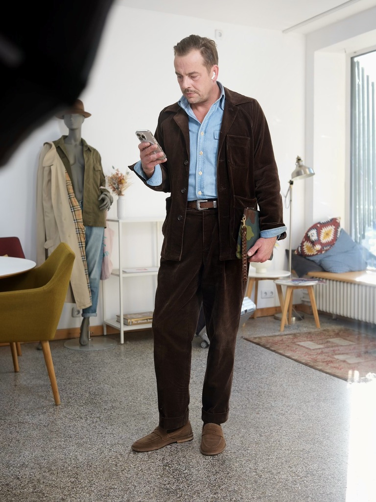
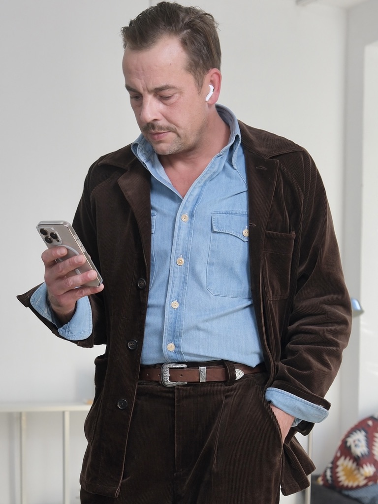
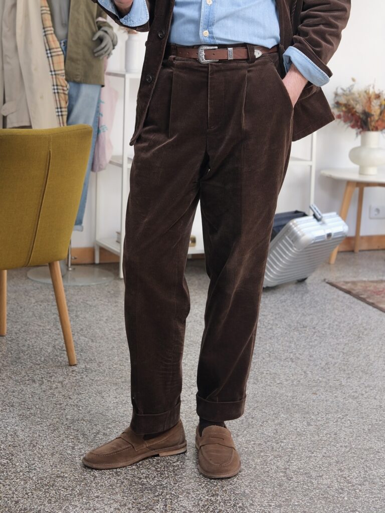
A brown corduroy suit already sits somewhere between tailoring and workwear. The cloth does most of that work: thick, tactile, informal.
The blue chambray shirt pushes it further away from conventional suiting. So do the suede loafers and the Western belt. None of those details cancels the suit; they simply change its register.
What remains is the structure: matching jacket and trousers, a defined waist, a clear vertical line. The formality is still there, but it is carried by proportion rather than polish.
That is probably why corduroy suits are useful to me.
They keep the grammar of tailoring while allowing almost everything else to become casual.
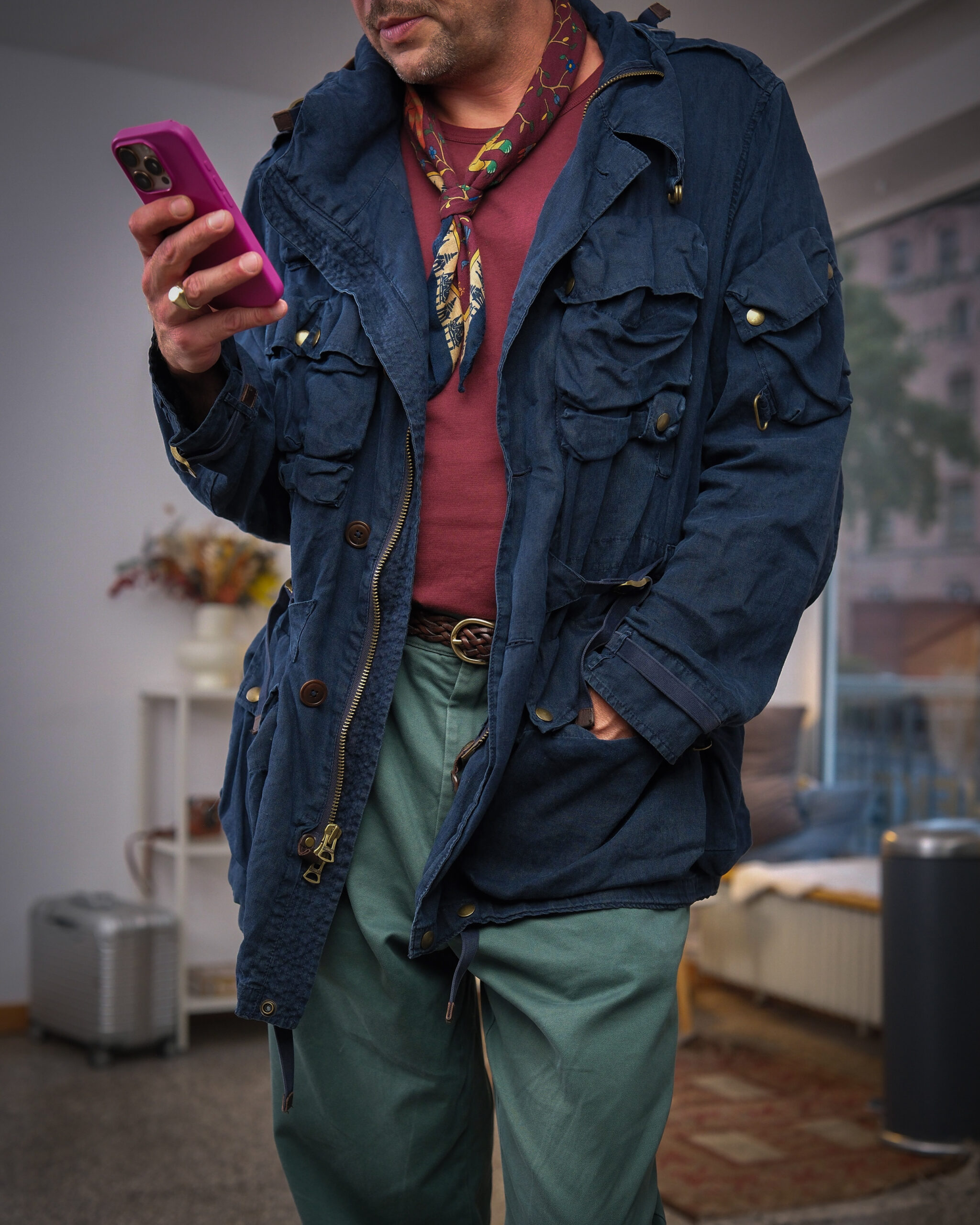
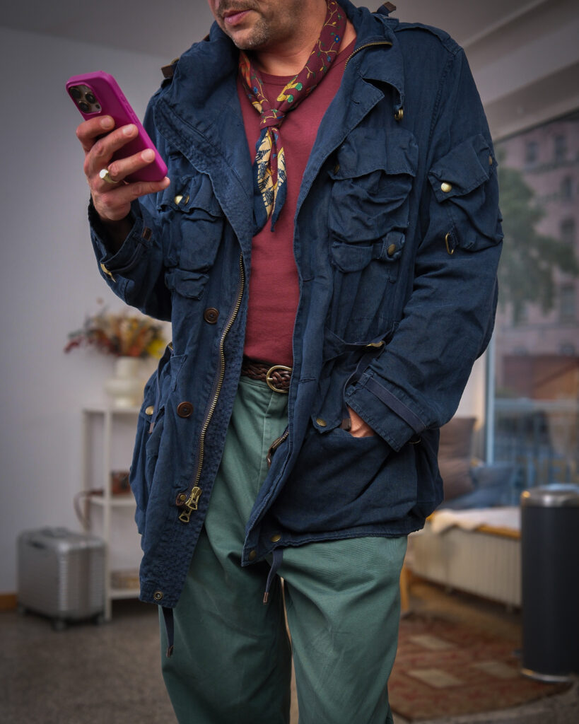
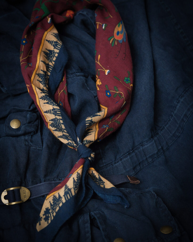
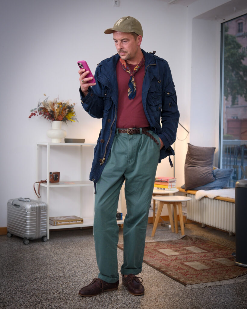
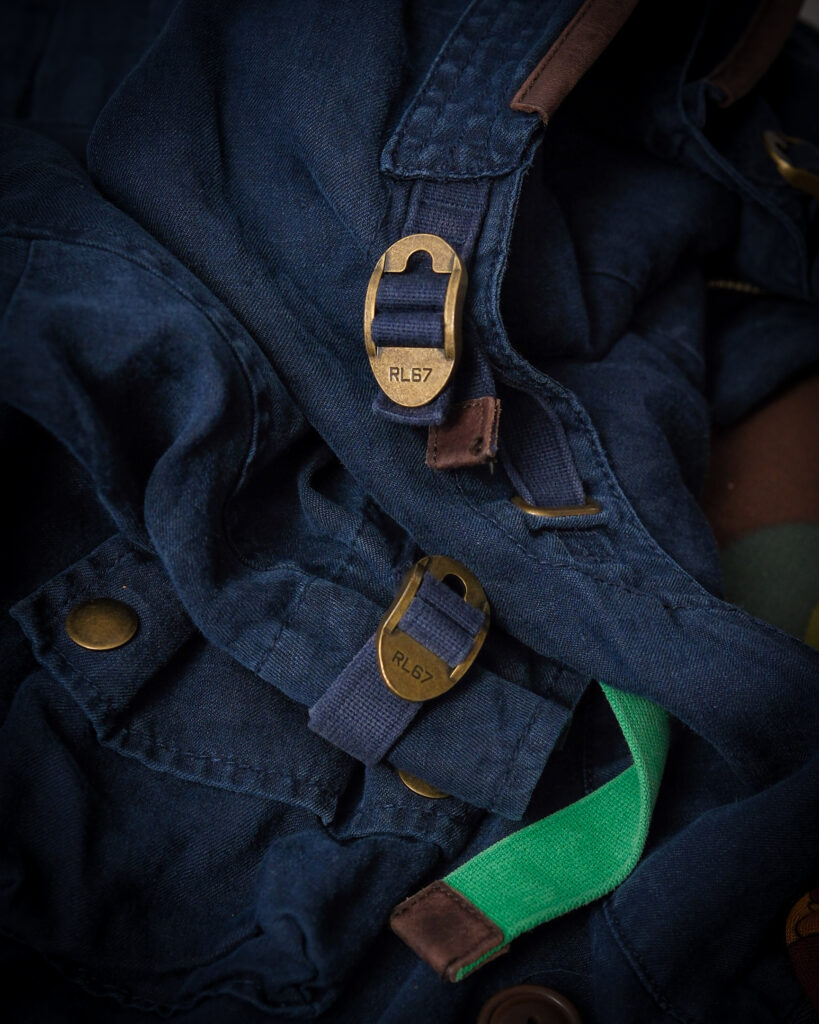
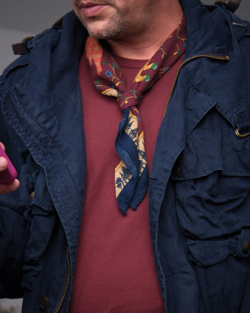
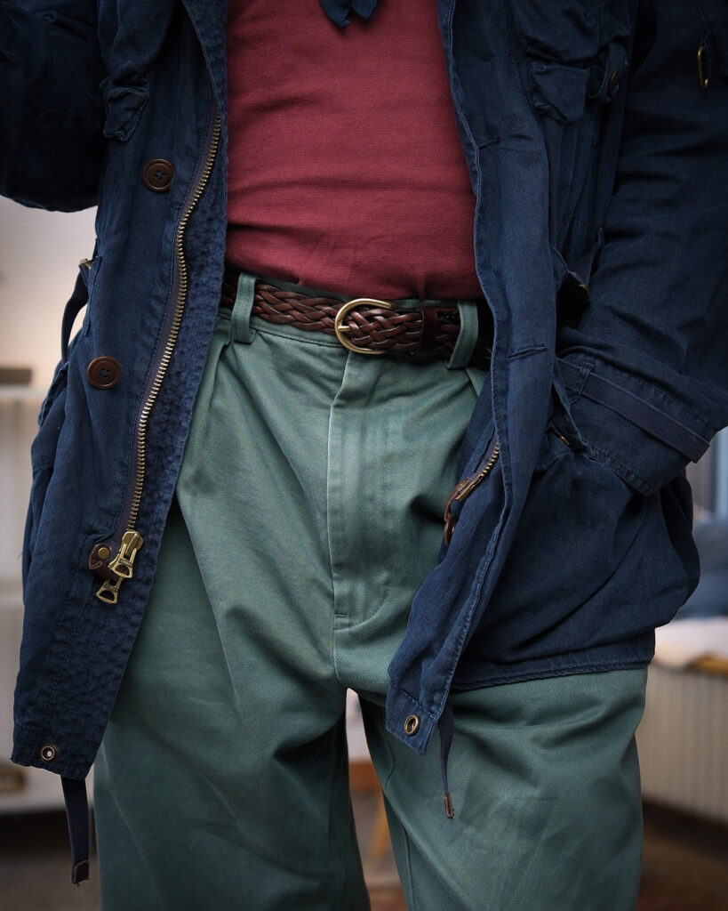
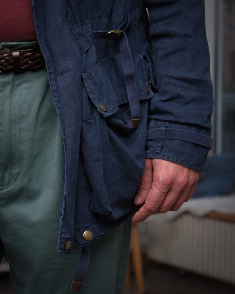
Likely early 2000s: washed navy linen, aged brass hardware and webbing straps against burgundy, muted green and printed silk. Military construction, strictly civilian circumstances.
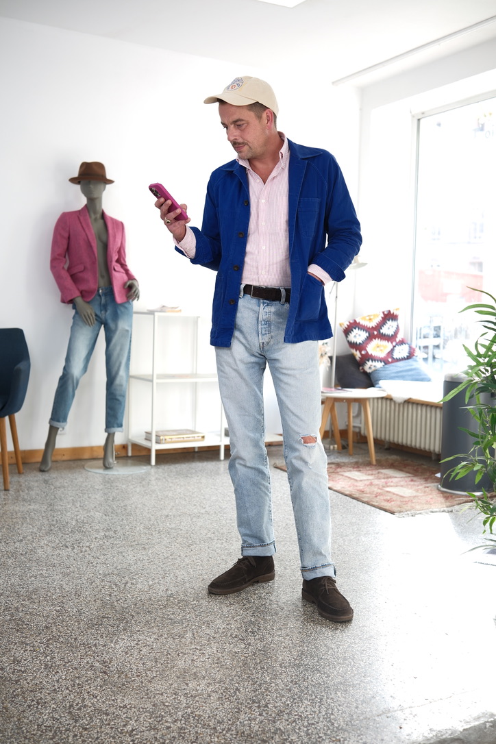
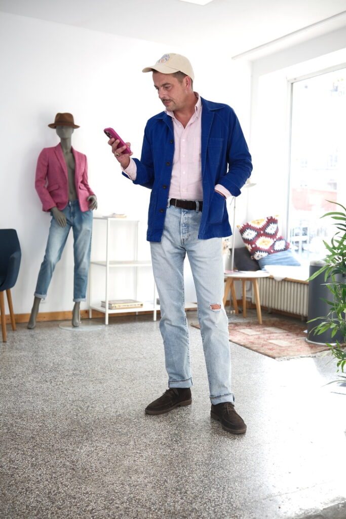
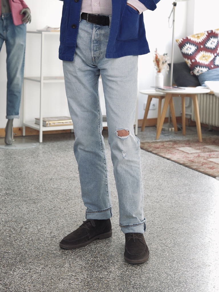
French blue can become almost too easy: chore jacket, faded denim, brown suede shoes. Familiar colours, familiar references.
The pink striped shirt changes the temperature. It is still a classic shirt, but the colour prevents the workwear from becoming too literal. The pale cap does something similar at the other end of the outfit: less contrast, more distance from the original blue-collar reference.
What remains is not really workwear and not really Ivy either. The jacket provides the structure, the denim keeps it ordinary, and the shirt slightly changes the register.
Sometimes a familiar combination only needs one colour that belongs to a different vocabulary.
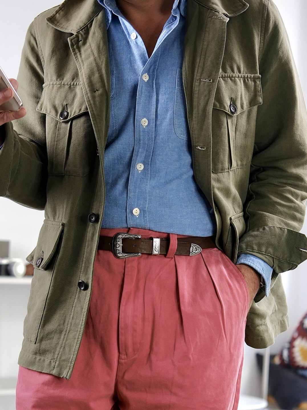
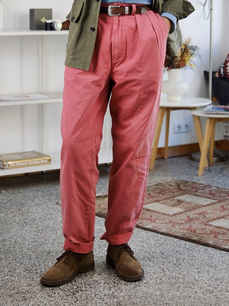
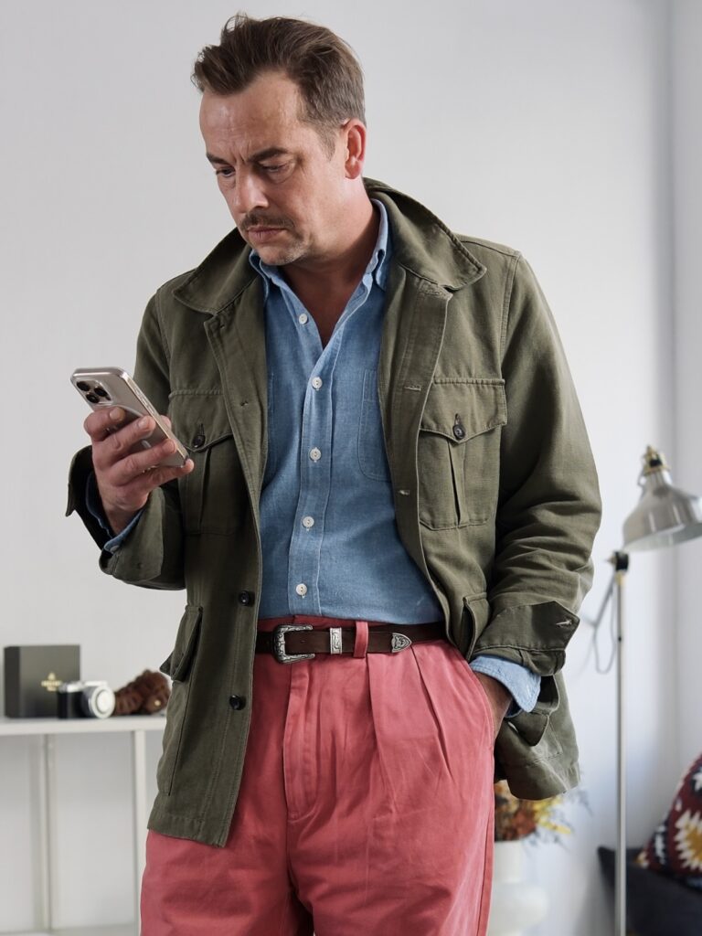
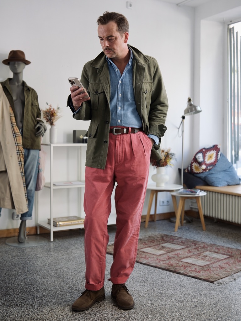
Coral trousers should dominate this outfit. They almost do.
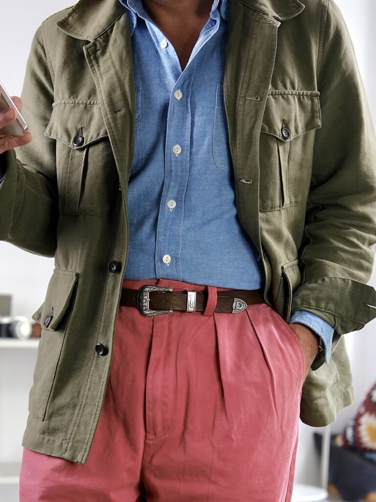
The high rise and deep pleats give the colour a large, uninterrupted field, but everything around it is quieter: an olive Polo Ralph Lauren M65, a pale Poszetka chambray workshirt and a narrow Western belt.
What interests me is that the military and workwear references do not add more visual noise. They actually make the trousers easier to wear. Olive and faded blue absorb some of the intensity of the coral; the belt adds one small, sharper detail at the waist.
The colour remains unusual. The outfit around it does not.
Perhaps strong colour becomes easiest when everything else behaves like a neutral.
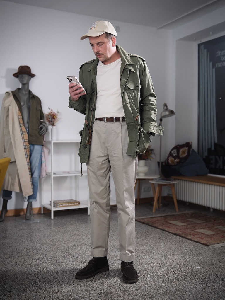
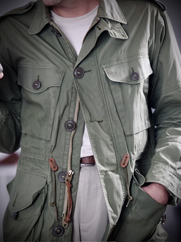
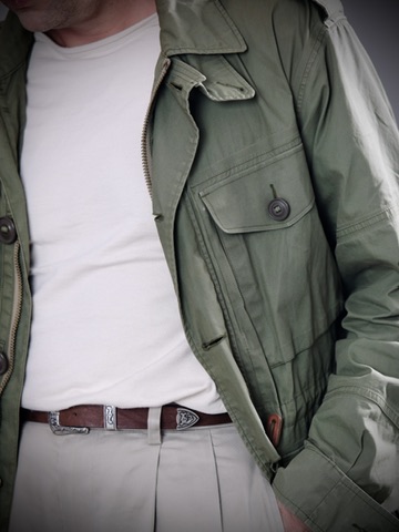
The M65 usually brings enough detail on its own: four pockets, epaulettes, drawcords, buttons, zip, hardware.
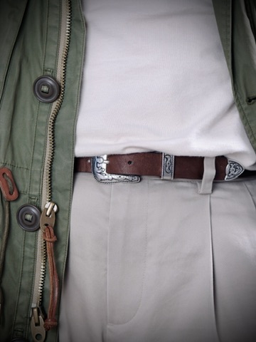
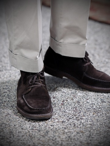
Here, almost everything around it is deliberately quiet. An ecru T-shirt, stone pleated trousers, dark brown suede moc-toe boots and a pale cap. The colours sit close to one another, leaving the olive field jacket as the only real piece of equipment in the outfit.
What changes is the role of the jacket. It no longer needs to carry a military look. It simply becomes the textured outer layer over otherwise clean, almost tailored proportions.
Sometimes the easiest way to wear military clothing is to remove everything military around it.
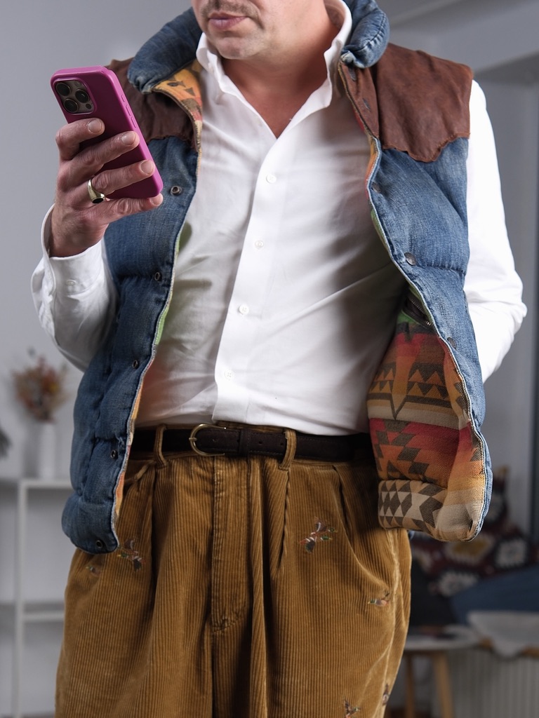
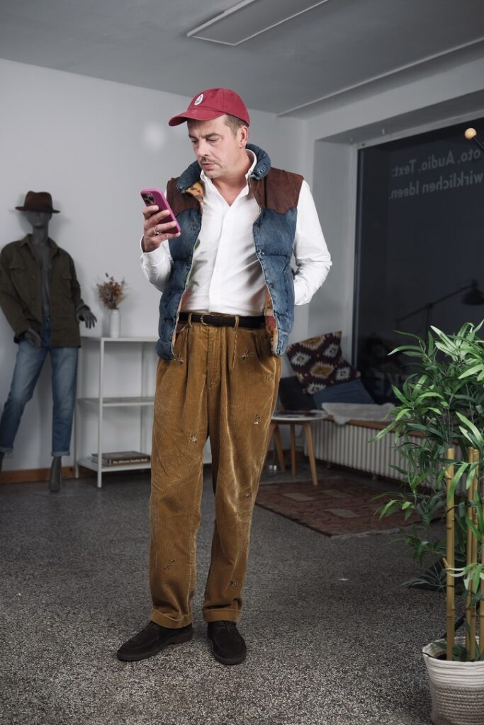
A denim vest with a suede yoke, patterned lining, embroidered corduroy trousers, a white shirt and a faded red cap. On paper, there is already too much going on.
What keeps it together is that the details are spread across different surfaces. The vest carries most of the construction: denim, leather, quilting, lining. The trousers add embroidery, but in a colour close enough to the corduroy that it reads more as texture than decoration. The white shirt interrupts both.
Nothing here is neutral in itself. Together, though, the pieces begin to balance one another.
Sometimes an outfit does not need restraint. It just needs the details to compete at different volumes.
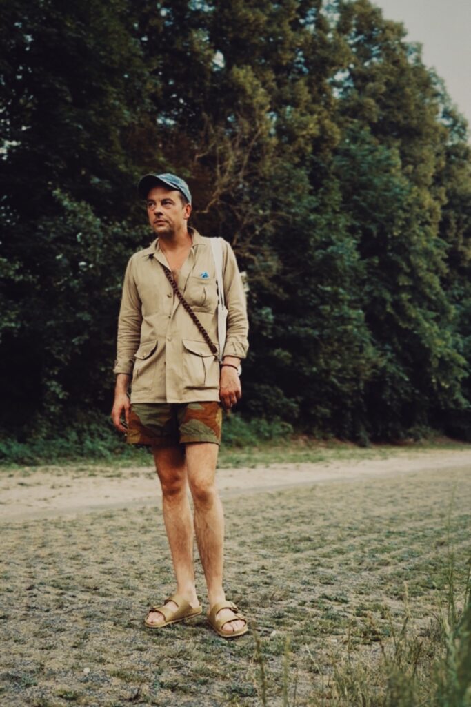
A camouflage short, a camel herringbone jacket and the colours of a hot August evening. Sometimes military references work best when their original logic almost disappears. The camouflage shorts are the loudest part of this outfit, at least in theory. In practice, they almost disappear.
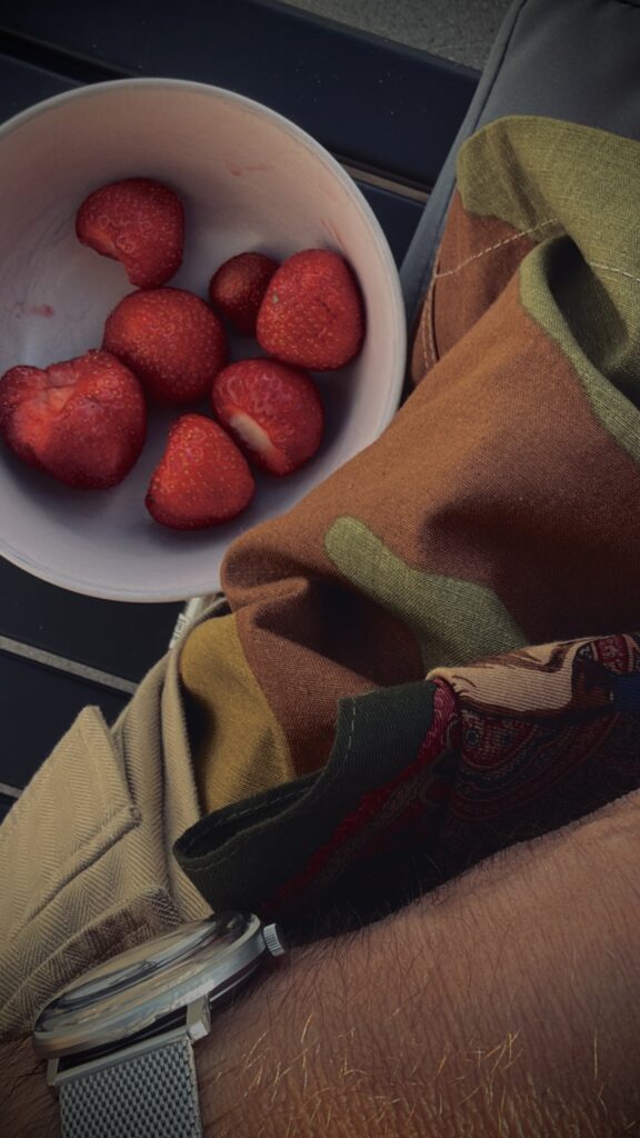
Their brown, olive and muted green sit close to the camel herringbone of the jacket. Against bare skin, leather sandals and the dry colours of late summer, camouflage stops behaving like a graphic pattern and becomes something closer to a palette.
That changes the military reference. There is still a field-jacket vocabulary in the pockets and practical construction of the surchemise, and obviously in the shorts themselves. But nothing here feels like an attempt to reproduce a uniform. The materials are too soft, the proportions too relaxed, the context too ordinary.
What interests me is how easily these colours move between categories. Camel can belong to tailoring, safari clothing or workwear. Olive can mean military clothing, but also simply summer vegetation. Brown can be leather, dry ground or part of a camouflage print.
Seen together, they become less about where the garments came from and more about where they are being worn. Perhaps that is when a reference becomes useful: when you can still recognise its origin, but no longer have to dress like it.
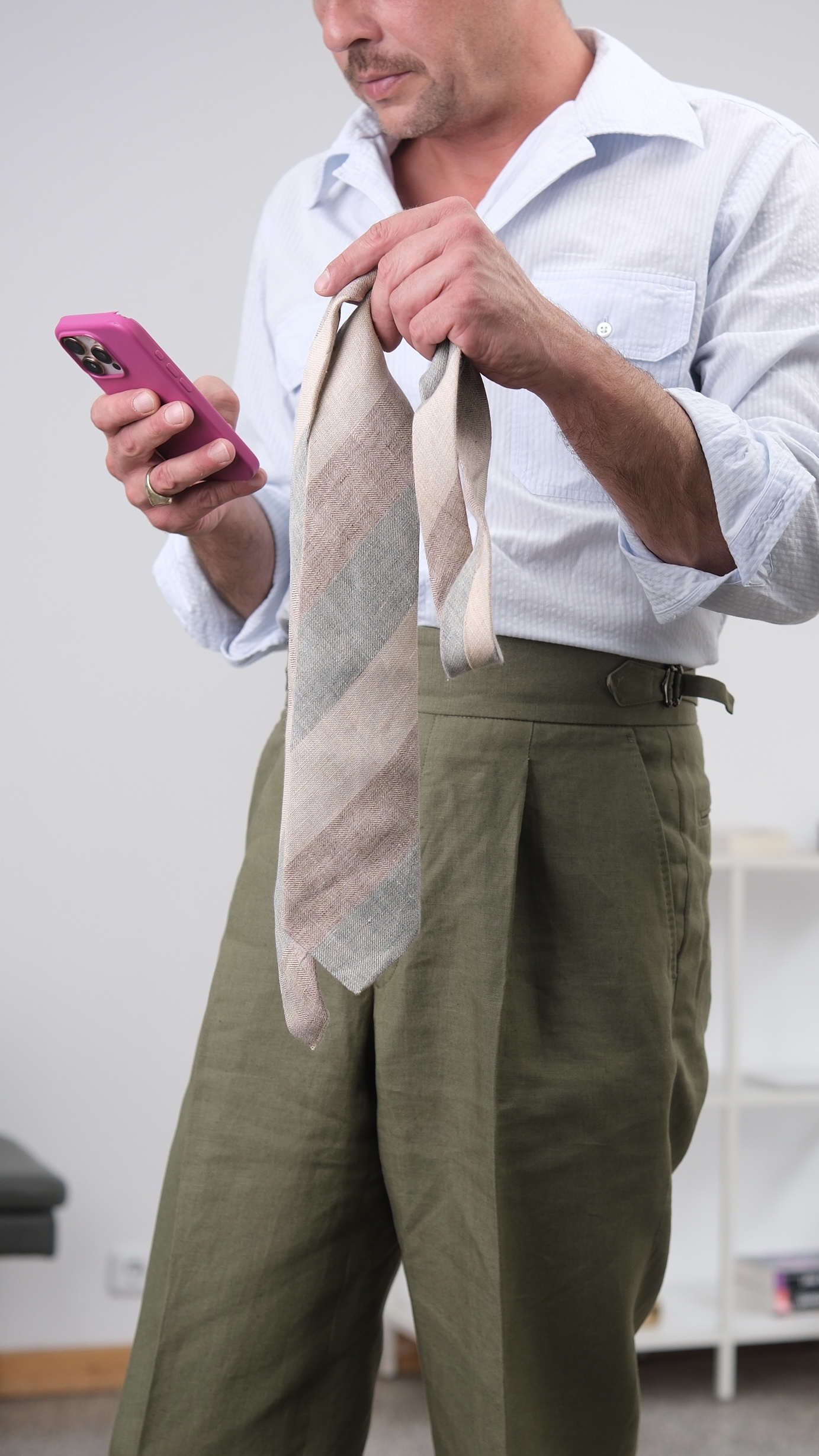
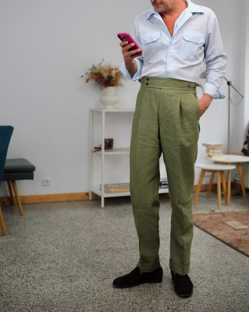
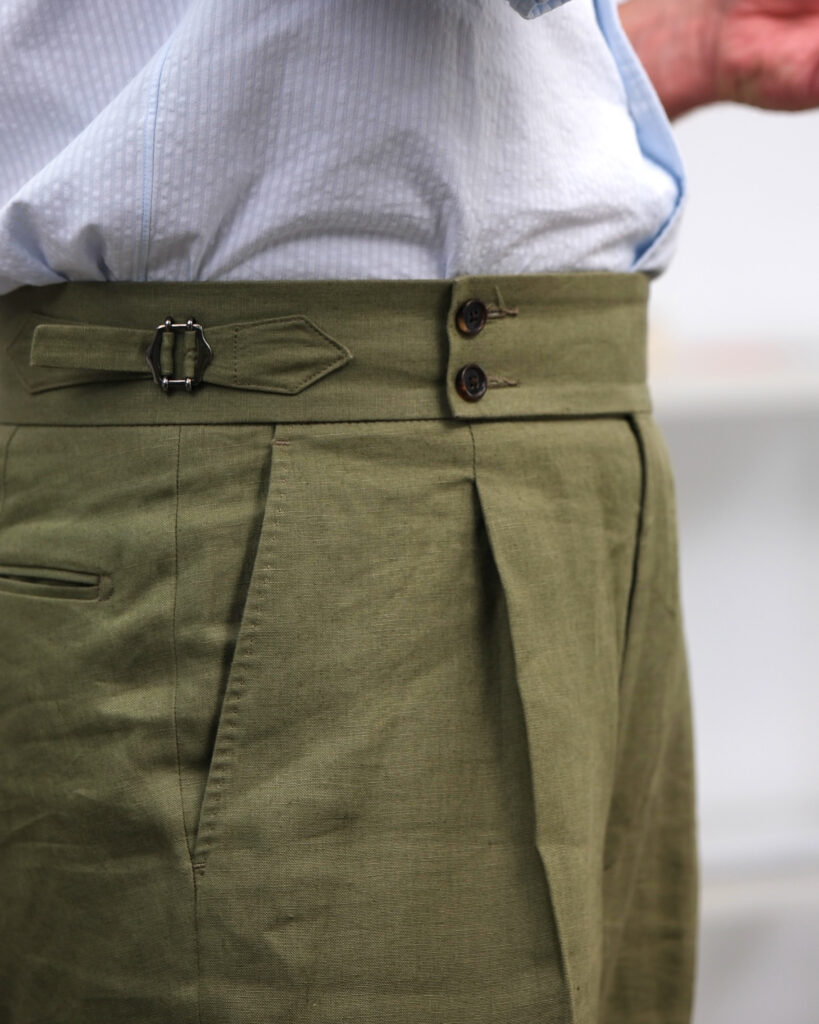
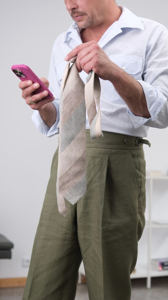
The trousers are probably the most tailored part of the outfit: high rise, deep pleats, extended waistband and side adjusters. But Poszetka makes them in Irish linen, removing much of the formality those details usually imply.
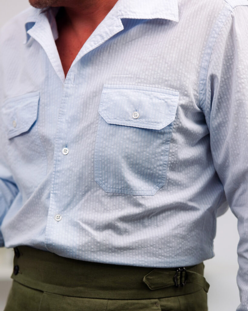
The same happens above. A pale seersucker workshirt replaces the dress shirt. Even the herringbone tie is linen. And a Drake’s × Sebago cap can interrupt the whole thing before it becomes too resolved.
What remains of tailoring is mostly structure: the waist, the pleats, the proportions, the tie. Perhaps summer tailoring is less about dressing formally than keeping the grammar while changing the materials.
I wear the scarf often, but here it does something unusually precise: it connects the yellow knit to the otherwise muted outer layers.
The outer layer – olive technical cotton – sits firmly in a muted, mid-warm spectrum. Its matte, slightly dry surface absorbs light, creating a stable, utilitarian frame. The fabric’s density and structure reference military field garments, where function dictates form.
Beneath, the knit introduces a concentrated warm signal. The yellow is neither bright nor acidic; it is slightly dulled, closer to ochre. This reduces optical aggression while maintaining chromatic presence. As a result, it functions as a core—visually central, but not disruptive.
The scarf complicates the system. Its dark ground stabilizes the composition, while the distributed warm accents (rust, muted orange) echo the knit. The pattern operates at a higher frequency, adding micro-variation without increasing overall contrast excessively.
The trousers, in grey flannel, act as a neutral sink. Their soft, fibrous surface diffuses light and removes chromatic pressure from the lower half. This stabilizes the system vertically.
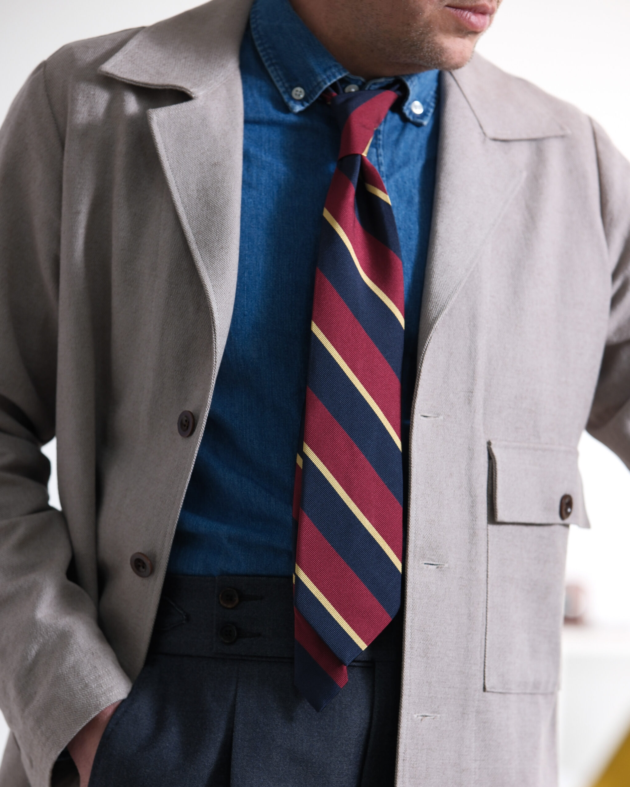
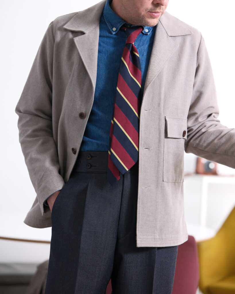
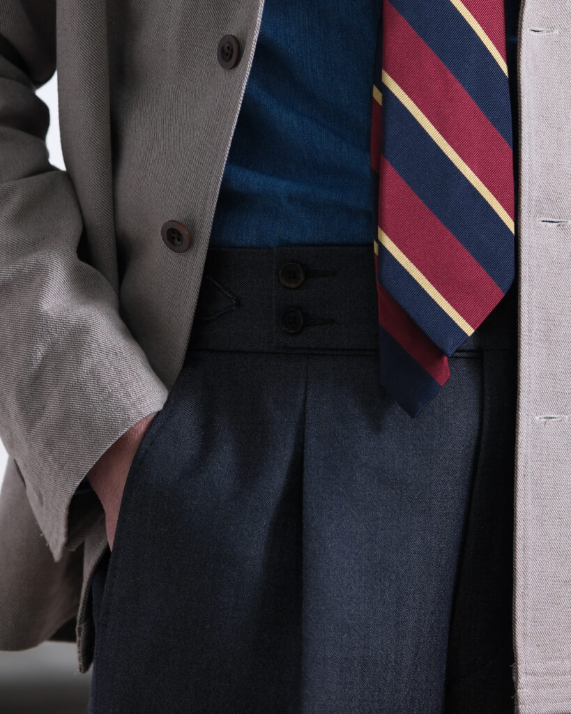
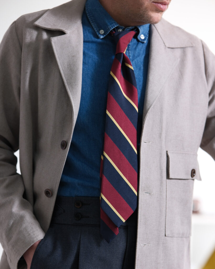
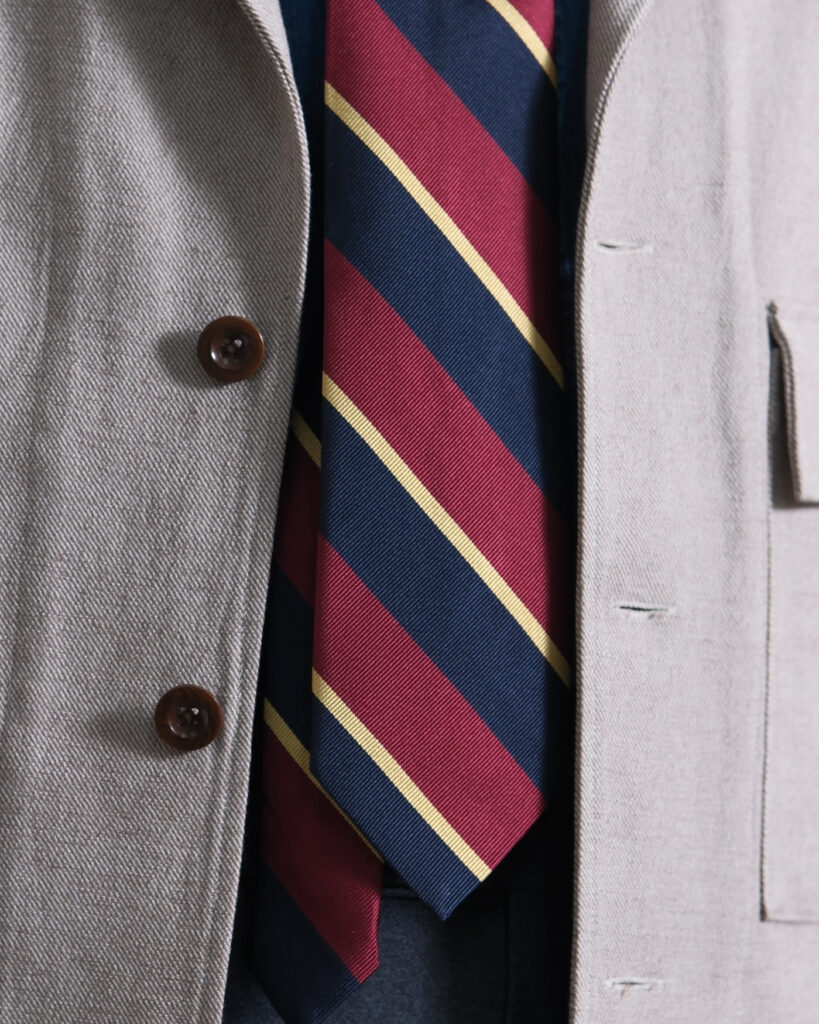
A 1950s Polish work jacket, remade by Poszetka in hemp. Worn with a denim shirt, striped tie and high-waisted grey trousers.
The original reference is workwear, but very little of that context remains. The hemp gives the jacket a dry, almost tailored surface, while the trousers and tie pull it further away from its utilitarian origins. Even the denim shirt sits somewhere between workwear and Ivy.
I like clothes that retain traces of what they once were without requiring you to dress around that history. The reference remains. The context changes.
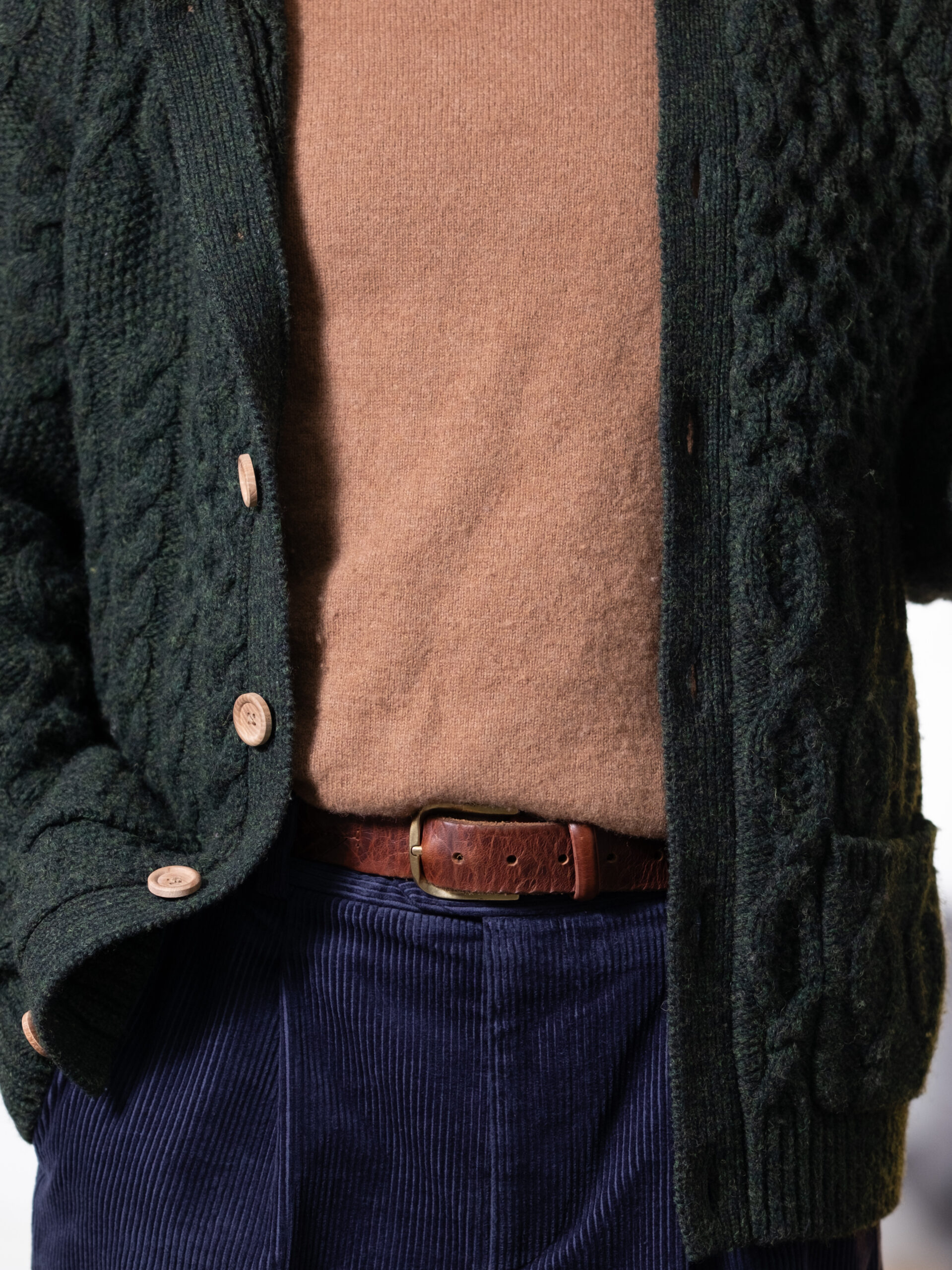
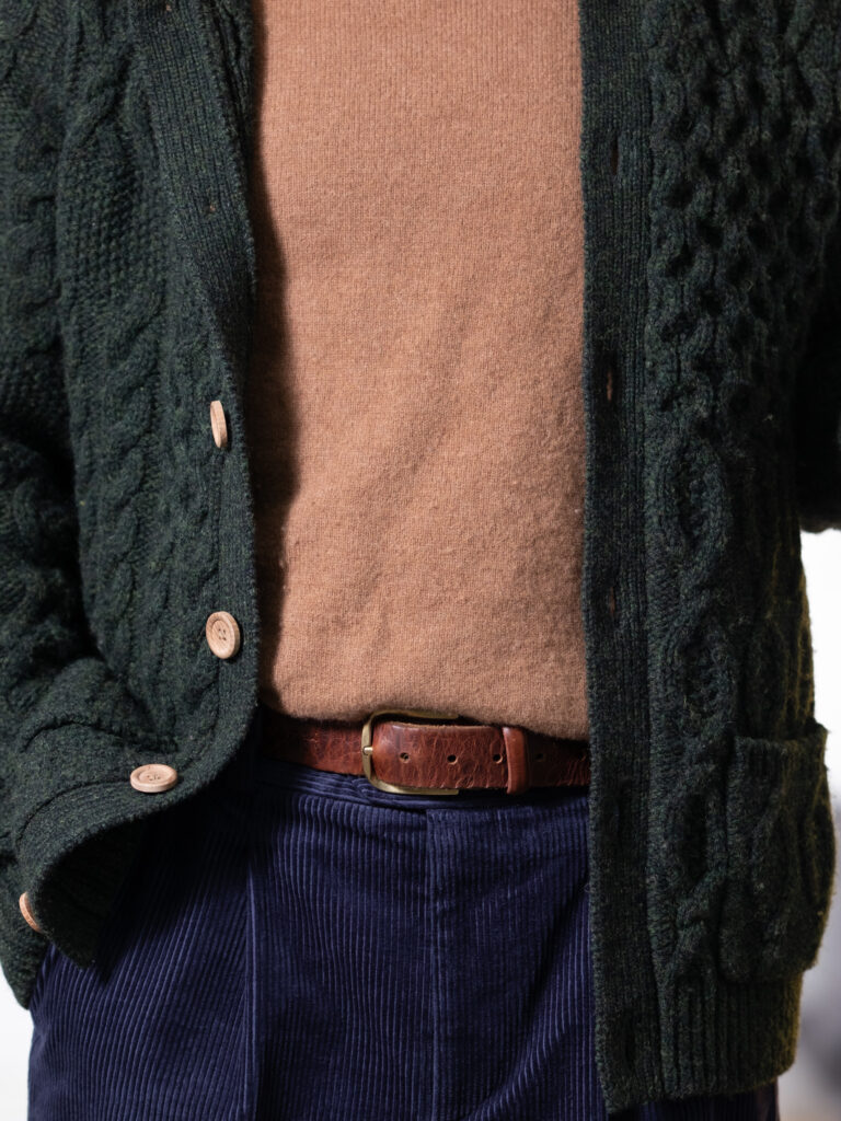
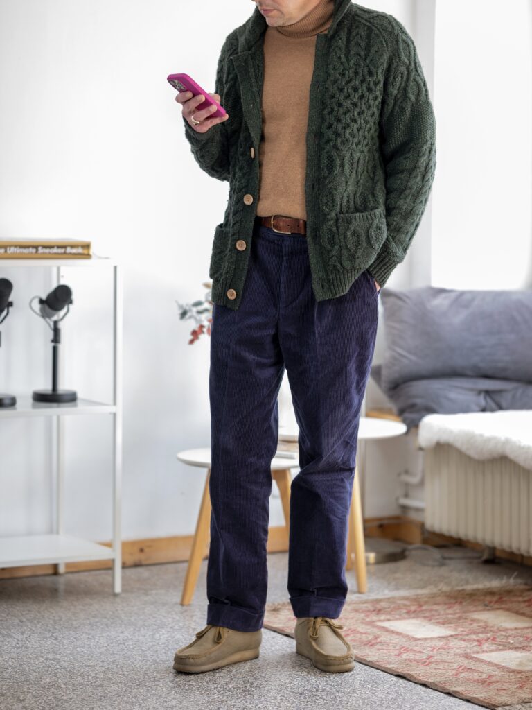
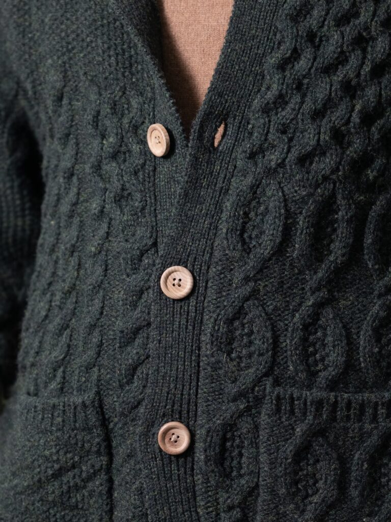
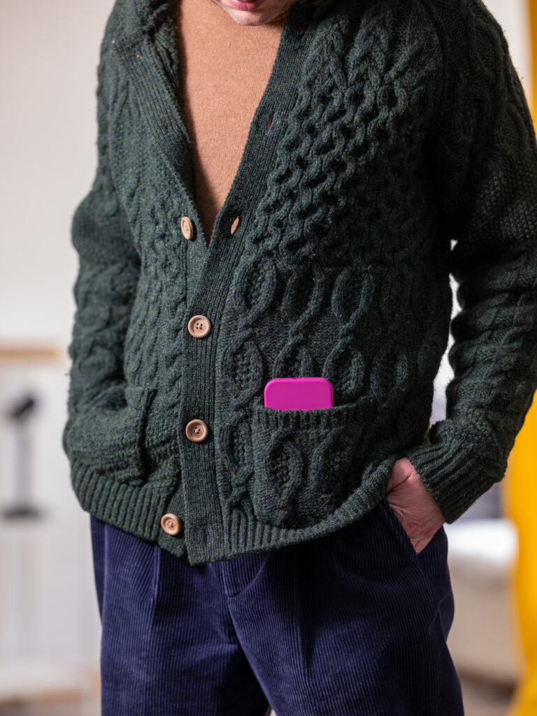
A Beams Plus cardigan, a lambswool rollneck and Poszetka navy corduroy trousers. Three familiar autumn materials, but three different surfaces.
The cardigan is coarse and irregular, the rollneck almost flat, the corduroy repetitive and vertical. Dark green, brown and navy work in much the same way: closely related without becoming monochromatic.
There is no single piece providing the contrast. Instead, the differences accumulate. Perhaps this is another version of the same idea: a small vocabulary becomes more interesting through increasingly precise variations.
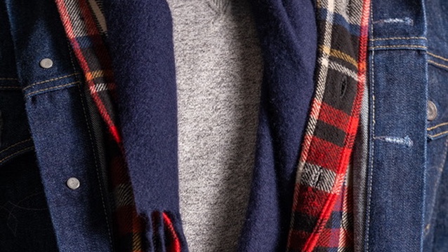
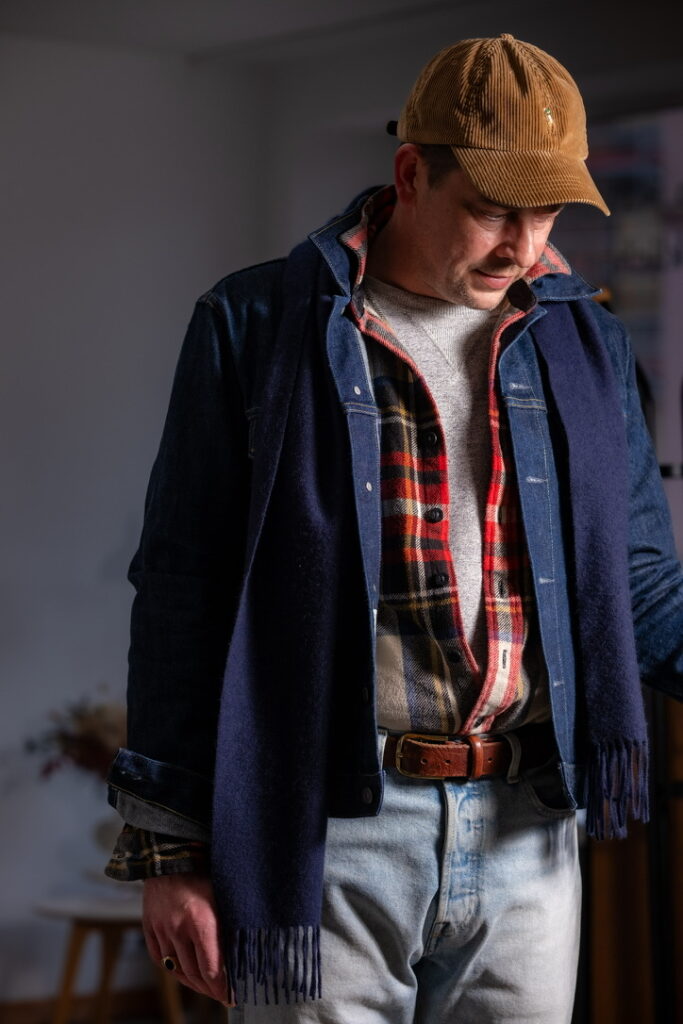
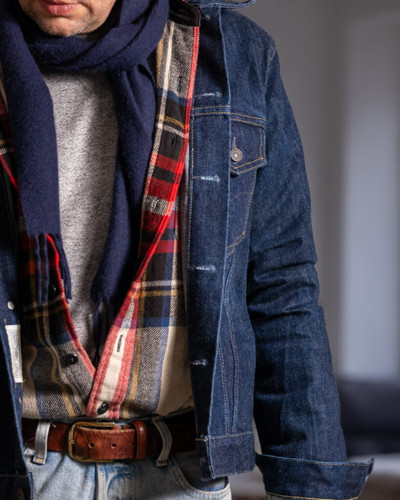
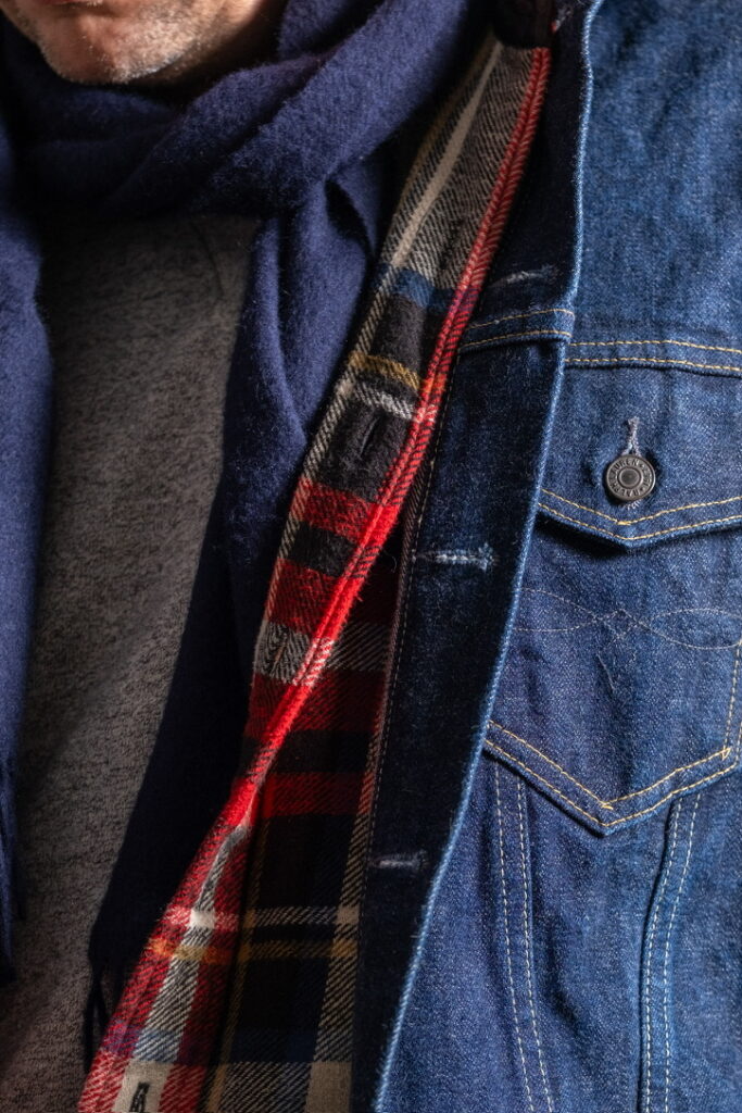
The composition is anchored in indigo and navy—denim jacket and scarf forming a cool, low-luster outer shell. These surfaces absorb light rather than reflect it, creating a stable, matte field.
Into this controlled coolness enters the flannel shirt. Its plaid structure introduces warm chromatic disruption: red, ochre, and off-white intersecting in a high-frequency pattern. The contrast is not only chromatic but structural—broad denim twill versus soft, brushed flannel.
The knit layer beneath, in heathered grey, acts as a thermal mediator. Its mixed fibre coloration diffuses both warm and cool inputs, reducing tension between the outer denim and inner plaid.
The corduroy cap extends the warm register upward. Its ribbed surface reflects light directionally, creating alternating bands of highlight and shadow. Compared to the flat absorption of denim, this introduces a subtle visual rhythm at the top of the composition.
The jeans, in washed blue, echo the jacket but with reduced saturation and increased surface irregularity. Fading introduces micro-contrast, softening the overall system.
Stylistically, the vocabulary is rooted in American workwear: denim jacket, flannel shirt, five-pocket jeans. However, the addition of a wool scarf shifts the context—less functional layering, more controlled composition.
The key mechanism is interruption. A cool system, destabilized—precisely—by warm pattern.
Er steht am Fenster, das eigentlich nicht zu öffnen ist, und draußen fährt ein Bus vorbei, in dem niemand sitzt, und es wirkt kurz so, als hätte das etwas mit ihm zu tun. Irgendwo summt ein Gerät, das niemand zuordnen kann, vielleicht ein Kühlschrank oder etwas Technisches aus einem anderen Raum.
The palette is subdued but layered: deep green, indigo, grey, with small warm interruptions. It operates within a cool, desaturated field, where colour is secondary to surface. Green dominates as the outer shell. Indigo stabilises the base. Grey softens the centre. The scarf introduces isolated warmth—rust, orange, small floral tones—without shifting the overall temperature.
The colour structure is stable with a single point of variation. Frame (green corduroy) → base (indigo denim) → centre (grey knit) → disruption (printed scarf).
Printed silk, fluid and irregular, reflects light differently across its surface. Pattern and fringe introduce movement, breaking the otherwise static composition. The composition is grounded and repetitive. Then one element shifts it. Structure remains intact. Surface becomes expressive.
Private Wardrobe Index – Field Note
Material defines the composition.
Corduroy forms the outer structure. Its vertical ribs create directional texture, catching light along the wale and absorbing it between. The result is depth without gloss. Denim provides density. Its compact twill surface absorbs light, forming a stable, grounded base.
The knit introduces softness. Its slightly fuzzy surface diffuses light and reduces visual tension at the centre.
A good grey cotton sweater, especially one made in Japan, operates through restraint rather than expression. The fabric is dense yet soft, with a dry handfeel that resists gloss and holds its shape over time. Its value lies in precision: even yarn, controlled knit tension, clean finishing at cuffs and hem. The grey is neither warm nor cold, but slightly melanged, allowing it to absorb and diffuse light without becoming flat. It does not draw attention, but stabilises everything around it. In a layered system, it functions as a neutral field—quiet, reliable, and materially exact.
Er hat sich so angezogen, als würde er gleich weiterfahren, vielleicht irgendwohin, wo es einen klaren Grund gibt, einen Grund zu sein. Stattdessen bleibt er stehen, hört kurz Schritte im Flur, die dann wieder verschwinden, und für einen Moment wirkt es, als hätte er etwas verpasst, ohne genau sagen zu können, was.
Tactile Variation – Between Workwear and Ornament
The look combines utilitarian materials with decorative textile elements. Corduroy and denim originate in workwear contexts—durable, structured, designed for repeated use. Their surfaces are defined by function rather than display. In contrast, the printed silk scarf belongs to a different system: ornament, narrative, and visual complexity. It introduces an element that is not necessary, but intentional. Their combination reflects a layered approach to dress.
Er lehnt im Flur, irgendwo läuft leise Musik, vielleicht irgendwas von Radiohead, ein alter Song, den man nicht mehr richtig zuordnen kann, und er hat sich angezogen, als müsste er gleich noch weiter, obwohl klar ist, dass nichts mehr passiert.
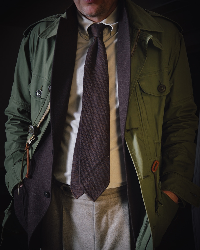
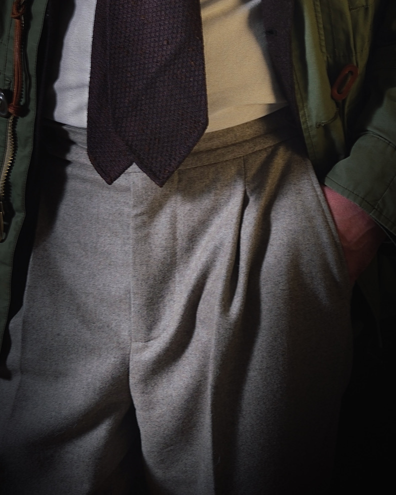
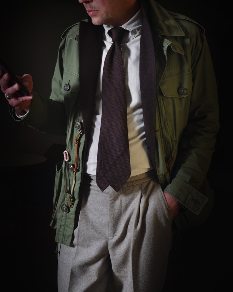
The palette remains tightly controlled: olive, brown, beige. It operates within a warm, desaturated spectrum, avoiding sharp contrast. Olive functions as the outer frame, slightly muted and utilitarian. Brown adds depth and density at the centre, while beige introduces light without becoming stark.
The colour structure is hierarchical rather than contrasting. Light (beige shirt) → depth (brown tie and jacket) → frame (olive shell) → base (beige flannel).
Shantung silk as textural counterweight in layered systems
Transitions are gradual, creating continuity instead of separation. Contrast is low, built through tonal shifts rather than opposition. The tie forms the visual centre, supported by the light of the shirt and framed by the jacket.
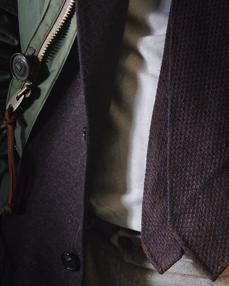
Material defines the composition. The technical cotton shell is compact and protective. Beneath it, cashmere softens the structure, absorbing light and reducing edge sharpness. The OCBD acts as a stable intermediary with a subtle woven texture.
The shantung grenadine silk tie introduces dryness and irregularity. Its granular surface absorbs light unevenly, creating depth without sheen. Flannel trousers anchor the look. Their brushed surface diffuses light and stabilises the lower half.
Utility outerwear layered over soft tailoring. Coherence emerges through aligned colour temperature and controlled surface behaviour.
Die Jacke bleibt an, obwohl es zu warm ist, einfach weil Ausziehen jetzt schon wie eine Entscheidung wirken würde. Jemand geht vorbei, schaut kurz, sagt nichts. Es ist dieser Moment, in dem alles kurz Bedeutung haben könnte, aber dann passiert es nicht.
Tactile variation – from field utility to soft tailoring integration
The look combines two historically separate systems: military fieldwear and civilian soft tailoring. The field jacket originates from mid-20th-century military garments designed for mobility, storage, and weather protection, later adopted into civilian wardrobes during the post-war period.
In contrast, flannel trousers, OCBD shirts, and textured ties stem from early to mid-20th-century menswear traditions—particularly Ivy League and British soft tailoring—where comfort and material depth replaced rigid formality. Their combination reflects a late 20th-century shift: functional garments layered over tailored structures, not for necessity, but as a controlled reinterpretation of utility within everyday dress.
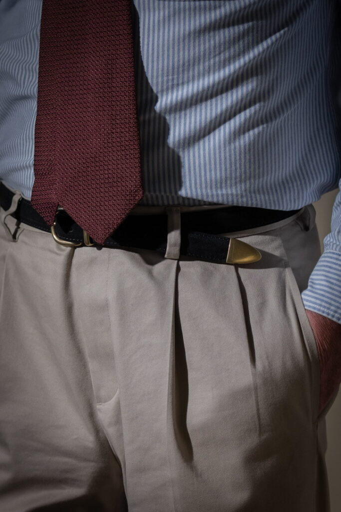
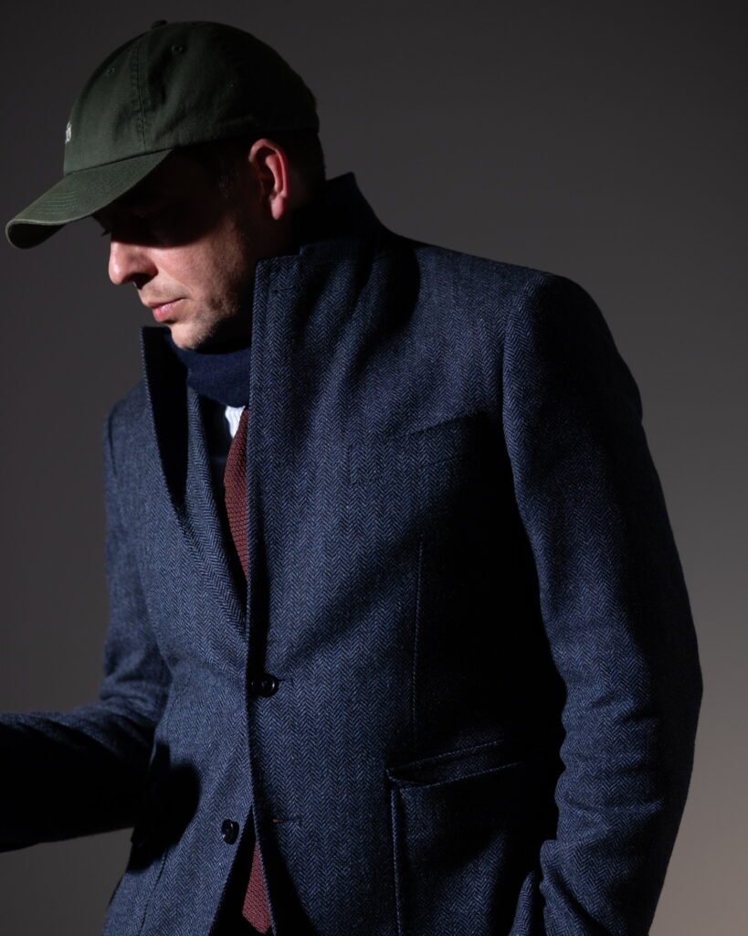
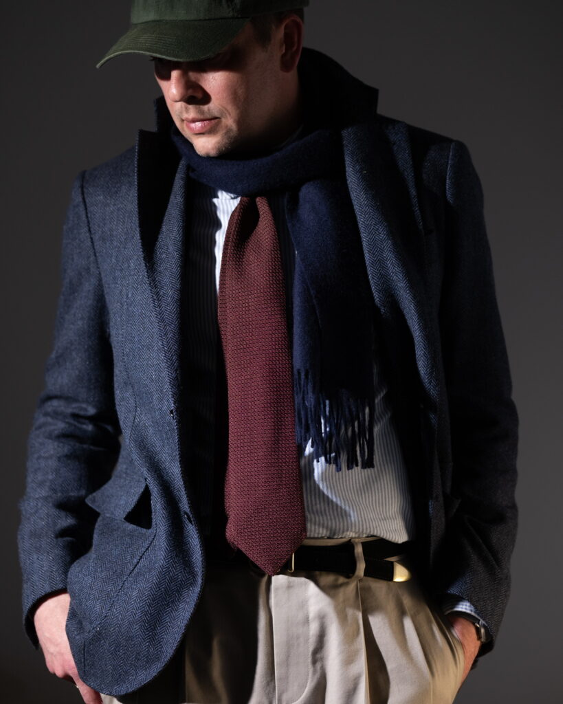
The palette is tightly controlled: deep navy, muted burgundy, and warm beige. The shirt introduces a cooler blue-white stripe, increasing brightness without disrupting the tonal cohesion. Overall contrast remains moderate, but is intensified locally through texture rather than colour.
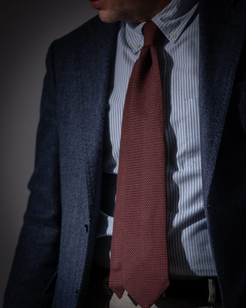
The central element is the tie—grenadine in a burgundy tone. Its open weave creates a granular surface that breaks light into micro-shadow. Unlike smooth silk, it avoids flat reflection. The result is depth without gloss, a surface that appears almost porous.
Kreide auf rauem Stoff
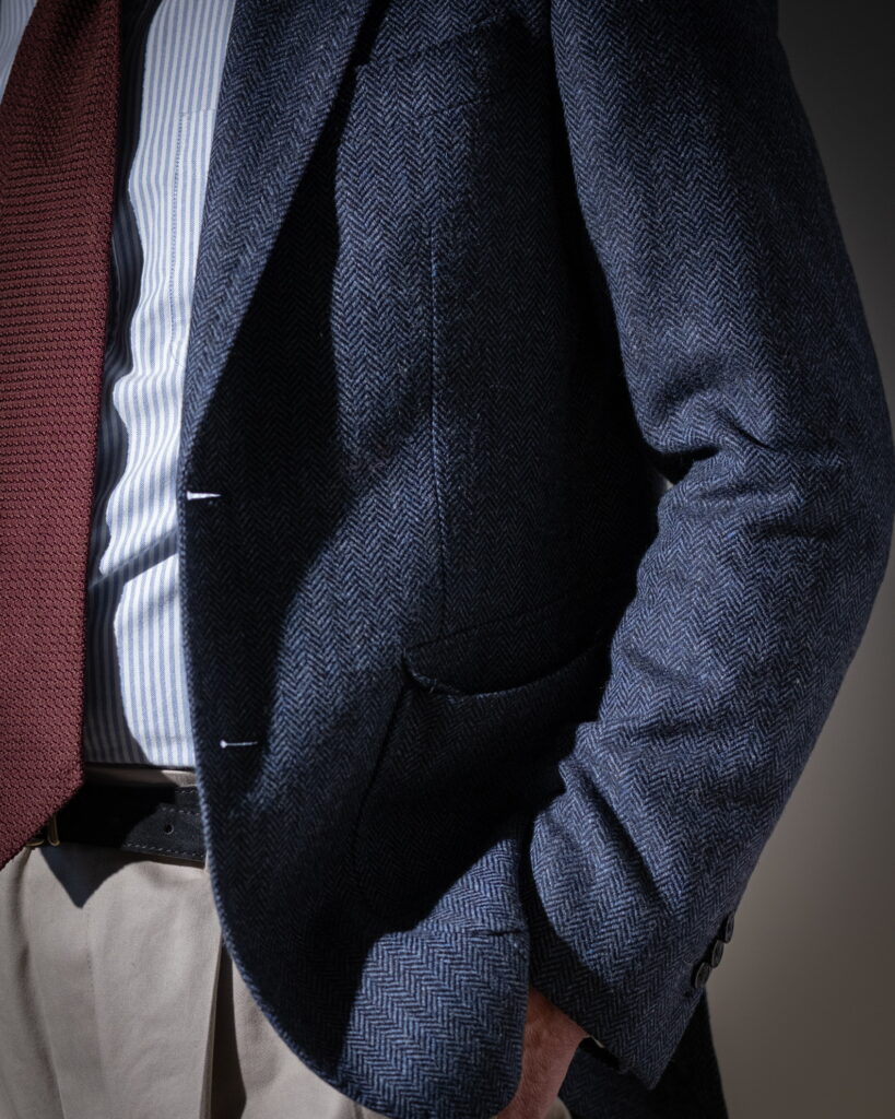
The blazer, in a navy herringbone wool, operates differently. Its pattern emerges only under light, with the chevron structure catching highlights intermittently. This creates a restrained, rhythmic texture—less active than the tie, but more structured.
The hierarchy is clear: granular center, structured shell, reflective shirt, stable base.
The shirt, a striped cotton, reflects light more directly. The vertical lines introduce optical rhythm and increase perceived sharpness. However, the weave remains dry, preventing excessive brightness.
The trousers, in beige cotton, provide a stable base. Their surface reflects softly, with enough structure to hold crease definition. The pleats create controlled shadow zones, reinforcing volume without adding contrast.
The scarf introduces an additional absorptive layer. Dark and dense, it reduces the overall reflectivity of the upper composition, framing the tie and limiting visual dispersion.
Stylistically, the system aligns with classic tailoring but shifts through material emphasis. The grenadine tie—historically formal—becomes the most texturally active element. The rest of the outfit supports it through restraint.
The palette is restrained but slightly unstable: indigo, brown, muted pink. It moves between cool density and softened warmth without fully settling. Indigo anchors the composition through denim and tie. Brown adds weight in the upper layer, while the shirt introduces a diffused light.
The colour structure is not strictly hierarchical. Base (indigo denim) → vertical link (navy tie) → warmth (brown corduroy) → light (pink OCBD) → disruption (belt). The system appears coherent, but one element resists integration.
Transitions are mostly gradual. Only one element breaks the logic.
Er sitzt noch da, das Hemd leicht zu warm, die Jacke offen, aber nicht ausgezogen, und irgendwo läuft Musik, vielleicht etwas von den frühen Strokes oder doch wieder Radiohead, und es ist egal, weil niemand richtig zuhört. Er sitzt noch da, als hätte er gerade etwas erledigt, aber eigentlich ist nichts passiert und er weiß das auch.
Material defines the composition
Denim forms a dense, compact surface with minimal reflection. Corduroy introduces directional texture, its ribs catching and releasing light rhythmically. The OCBD stabilises the centre through its structured weave, softening the colour.
The tie adds a dry, granular surface. Its irregular silk structure diffuses light, creating depth without shine. The belt operates differently. It is not woven, not structured in the same way. Its surface is organic, uneven, and visually assertive. It does not absorb into the system—it interrupts it.
The composition is controlled, but not resolved. Most elements align through texture and tone. The tie suggests structure. The belt introduces friction.
Tactile Variation – Between Structure and Disruption
The look combines different material traditions rather than a single stylistic system. Denim and the belt derive from utilitarian and rural contexts, where durability and directness define the material. In contrast, shirt and tie belong to a system of controlled dressing, where texture refines rather than dominates. The corduroy jacket mediates between both, carrying associations of both work and informal tailoring. Their combination does not resolve into harmony. It remains a composition where one element shifts the balance.
Auf dem Tisch steht ein Glas, das er schon eine Weile nicht mehr angerührt hat, und der Gürtel wirkt plötzlich zu deutlich für diesen Raum, fast so, als hätte er ihn für etwas anderes angezogen. Draußen wird es langsam dunkler, ohne dass sich drinnen etwas verändert. Man könnte jetzt gehen, aber es gibt keinen Moment dafür.
Camel is not a statement. It is a surface. Under artificial light it softens and adapts. The coat carries the visual weight; the rest can remain understated. Context shifts perception more than styling does.
A varsity jacket in an office setting depends on restraint. Chambray instead of crisp poplin. A wool tie instead of polished silk. Dark corduroy to anchor the colour. The formal elements stabilise the casual one. Without that balance, it becomes costume.
Corduroy absorbs light. That reduces contrast and softens transitions between garments. In this composition, pattern remains restrained. A muted stripe. A small medallion motif. Brown paired with subdued blue rather than high opposition. Nothing competes; elements sit next to each other without tension.
The wale structure diffuses reflection and gives the surface depth. Texture becomes the primary carrier of information. The eye registers material before colour, relief before contrast. Brown corduroy does not demand attention. It stabilises it.
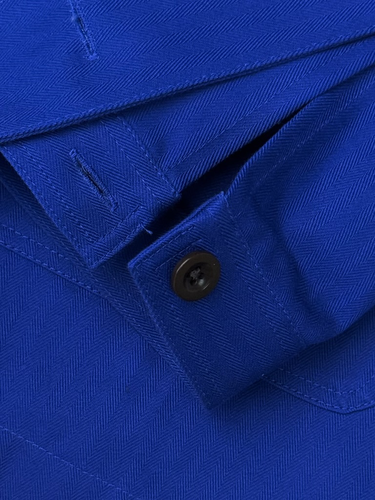
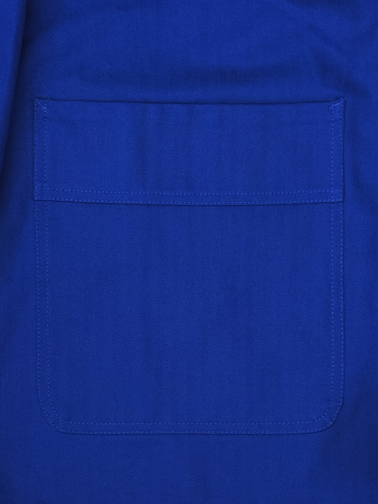
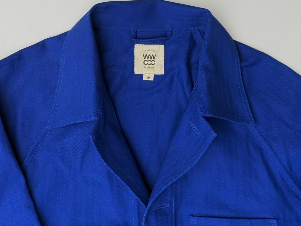
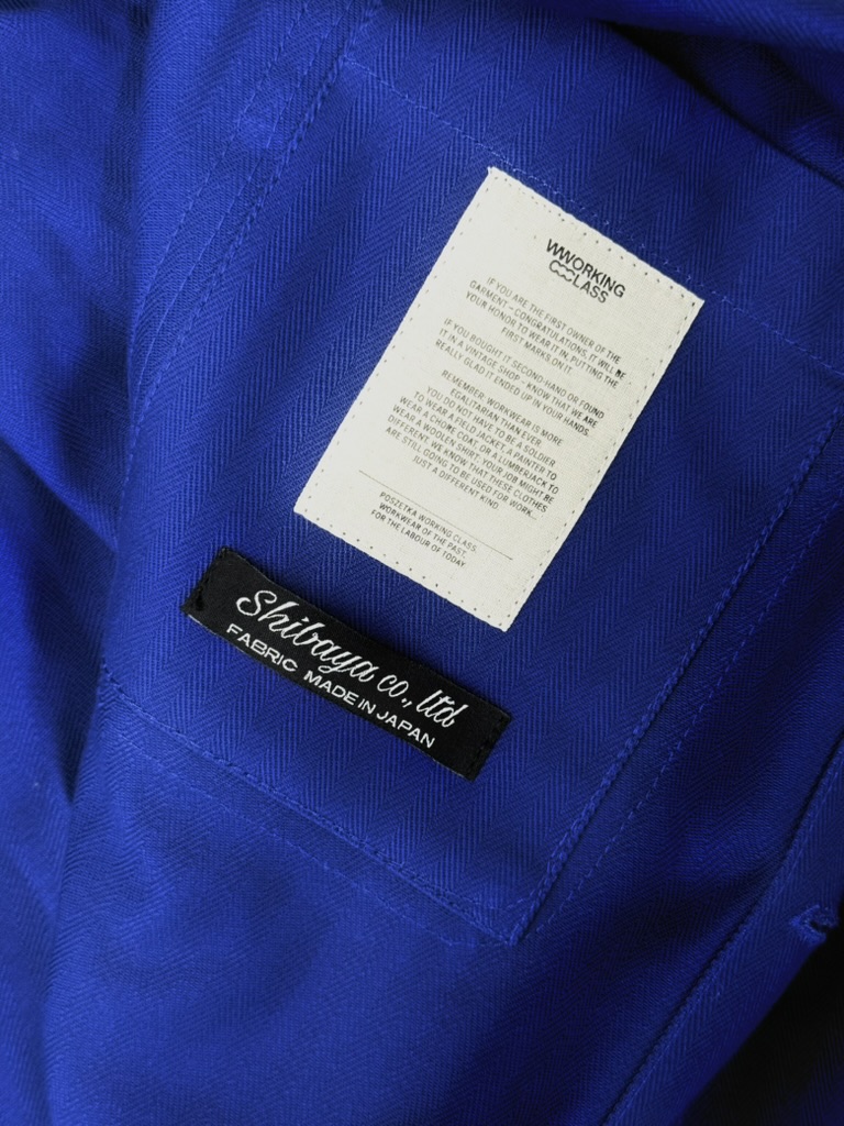
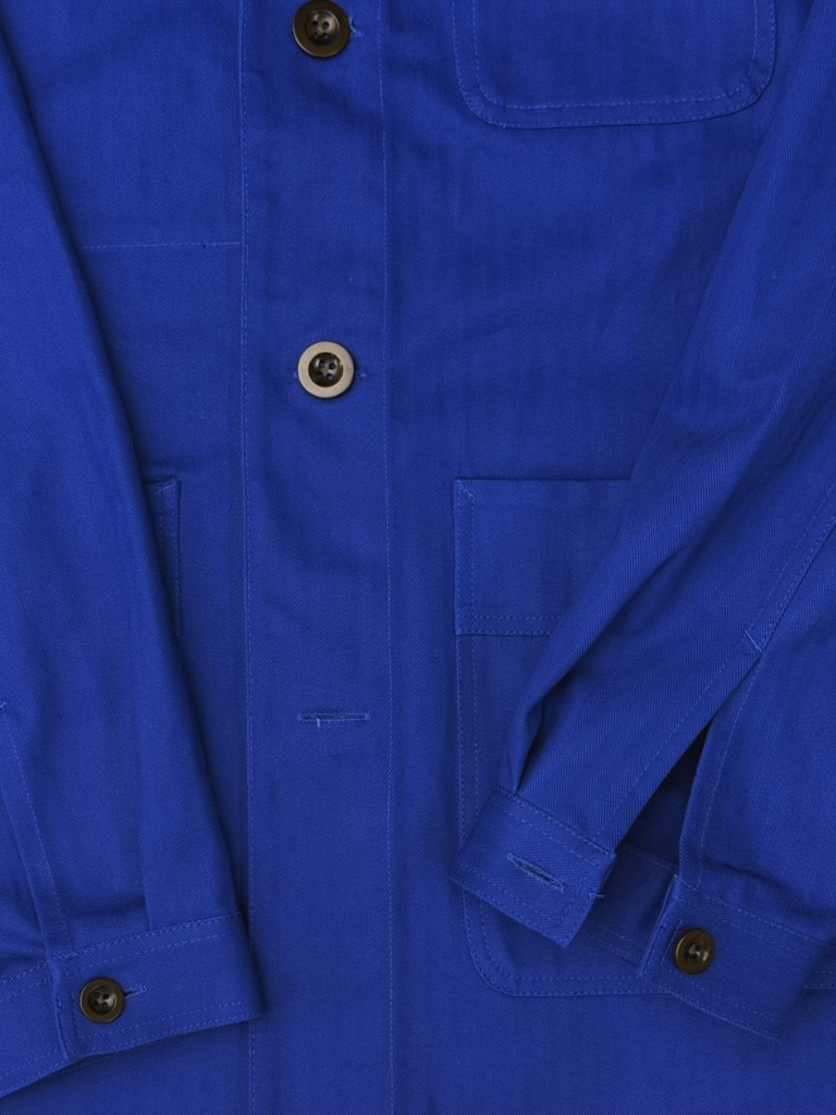
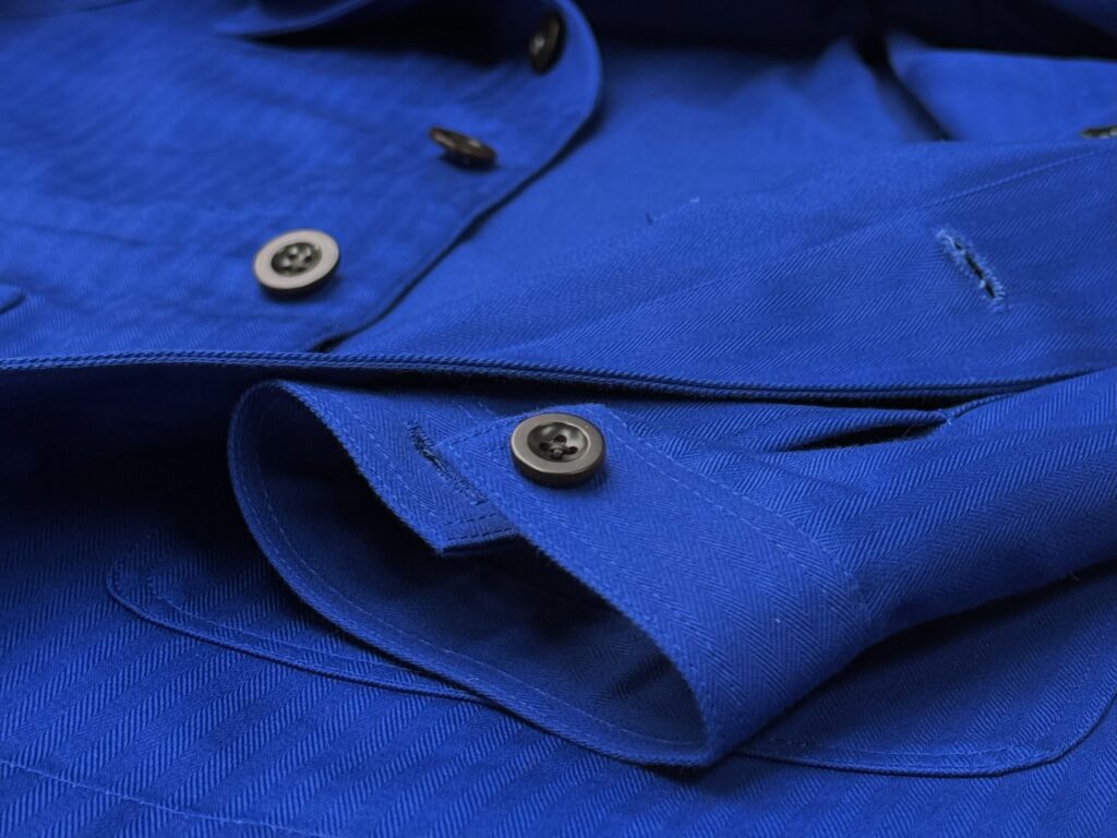
Der bleu de travail war nie für Auftritte gedacht. Er war ein Werkzeug – gefertigt aus dichtem Baumwolltwill, robust, unauffällig, gemacht für Menschen, die mit den Händen arbeiteten. Wie meine Opas.
Meinen ersten Arbeitskittel trug ich mit dreizehn. Er hing im Schuppen meines Großvaters, die Nähte ausgeleiert, der Stoff weich wie Butter. Ich zog ihn über ein weißes T-Shirt, dazu eine Cordhose. Es war eine Alternative zur Strickjacke. In jener Zeit wurden unsere Haare länger, wir verbrachten Nächte im Probenraum, und irgendwann berichtete MTV vom Tod Kurt Cobains.
Zwischen etwa 1880 und 1910 entwickelte sich der bleu de travail zu einer standardisierten Uniform für Fabrikarbeiter, Landarbeiter und Handwerker.
Der Kittel, den Opa trug – Arbeitskleidung als Kulturprodukt
Gefertigt wurde er aus widerstandsfähigem Baumwollköper oder Moleskin, meist in einem tiefen Indigoblau gefärbt. Diese Farbe hatte funktionale Gründe: Sie kaschierte Öl- und Schmutzspuren und ließ sich leicht nachfärben (Eicher, 2014; Riello, 2022).
Berufsgruppen wie Mechaniker, Eisenbahner, Hafenarbeiter, Drucker und Maurer trugen die Jacke nicht als Mode, sondern als Werkzeug. Schnitt und Material waren auf Bewegungsfreiheit, Haltbarkeit und niedrige Produktionskosten ausgelegt.
Die Einheitlichkeit der Arbeitsjacke stiftete zugleich soziale Identität: Sie visualisierte Zugehörigkeit zur Klasse der arbeitenden Bevölkerung und vermittelte eine Ethik des „honest labour“ – der sichtbaren, materiell gebundenen Arbeit (Roche, 1989; Sennett, 2008).
Der bleu de travail wird zum Symbol einer Sehnsucht nach Materialität in einer entkörperlichten Welt.
Von der Funktion zum Zeichen
Heute taucht der „Arbeitskittel“ wieder auf: in Städten, in Ateliers, in Redaktionen. Seine Funktion hat sich verschoben – von der Arbeitskleidung zum Kulturzeichen. Diese Verschiebung lässt sich kultursemiotisch lesen. Roland Barthes beschrieb in Le système de la mode (1967) den Übergang vom Gebrauch zum Zeichen: Kleidung verliert ihren unmittelbaren Zweck und gewinnt Bedeutung.
Richard Sennett betont in The Craftsman (2008) den moralischen Wert der materiellen Auseinandersetzung: die Idee, dass Berührung, Gebrauch, Wiederholung eine Form von Wahrhaftigkeit erzeugen. Genau diese Vorstellung zieht heute jene an, die selbst nicht mehr mit Werkzeugen, sondern mit Sprache, Bildern oder Konzepten arbeiten.
Mein Griff zu einem Kleidungsstück wie dem bleu de travail ist Nostalgie und leise Korrektur an der eigenen Abstraktion zugleich.
The semiotic guerrilla warfare
Mit der ästhetischen Aneignung der Arbeitskleidung in den 1960er- und 1970er-Jahren vollzog sich, was Dick Hebdige später als „semiotic guerrilla warfare“ bezeichnete – die bewusste Umcodierung eines funktionalen Objekts in ein kulturelles Zeichen. Seit den 1990er-Jahren erlebt der bleu de travail eine kontinuierliche Wiederentdeckung in Mode und Design. Workwear-Ästhetiken, inspiriert von Labels wie A.P.C., Nigel Cabourn, Vetra oder Le Mont St Michel, greifen die formale Strenge und Materialqualität der historischen Jacke auf.
Dick Hebdige beschrieb in Subculture: The Meaning of Style (1979) solche Gesten als semiotische Neuinterpretationen: Das Funktionale wird zitiert, das Alltägliche zum Zeichen. Menschen, die vornehmlich mit dem Kopf arbeiten, entzogen den bleu de travail seiner ursprünglichen Sphäre der Produktion und überführten ihn in einen symbolischen Kontext.
So bleibt Arbeitskleidung das vielleicht ehrlichste Modeprodukt, weil sie nie Mode sein wollte. Ihr Reiz liegt in der Diskrepanz zwischen Ursprung und Verwendung, zwischen Gebrauch und Bedeutung.
Diese Verschiebung verweist auf eine größere kulturelle Bewegung: die Suche nach Materialität und „authentischer“ Oberfläche in einer digitalisierten, immateriellen Arbeitswelt. In dieser neuen Lesart wurde der bleu de travail zu einem Medium des Widerstands gegen Überästhetisierung, eine Form stiller Gegenkommunikation.
Die Farbe, Knöpfe, Gewicht. Jetzt hängt er in meiner Garderobe. Der Arbeitskittel: grober Baumwollköper, fest, fast spröde. Kein Stilobjekt, kein Statement – eher ein Werkzeug, das geduldig auf Gebrauch wartet.
⸻
Literatur
Barthes, Roland: Le système de la mode. Paris: Seuil, 1967. Eicher, Joanne B.: Dress and Ethnicity: Change Across Space and Time. Oxford: Berg, 2014. Hebdige, Dick: Subculture: The Meaning of Style. London: Routledge, 1979. Riello, Giorgio: The Fabric of Civilization: How Textiles Made the World. New York: Penguin, 2022. Roche, Daniel: La culture des apparences: Une histoire du vêtement (XVIIe–XVIIIe siècle). Paris: Fayard, 1989. Sennett, Richard: The Craftsman. New Haven: Yale University Press, 2008.
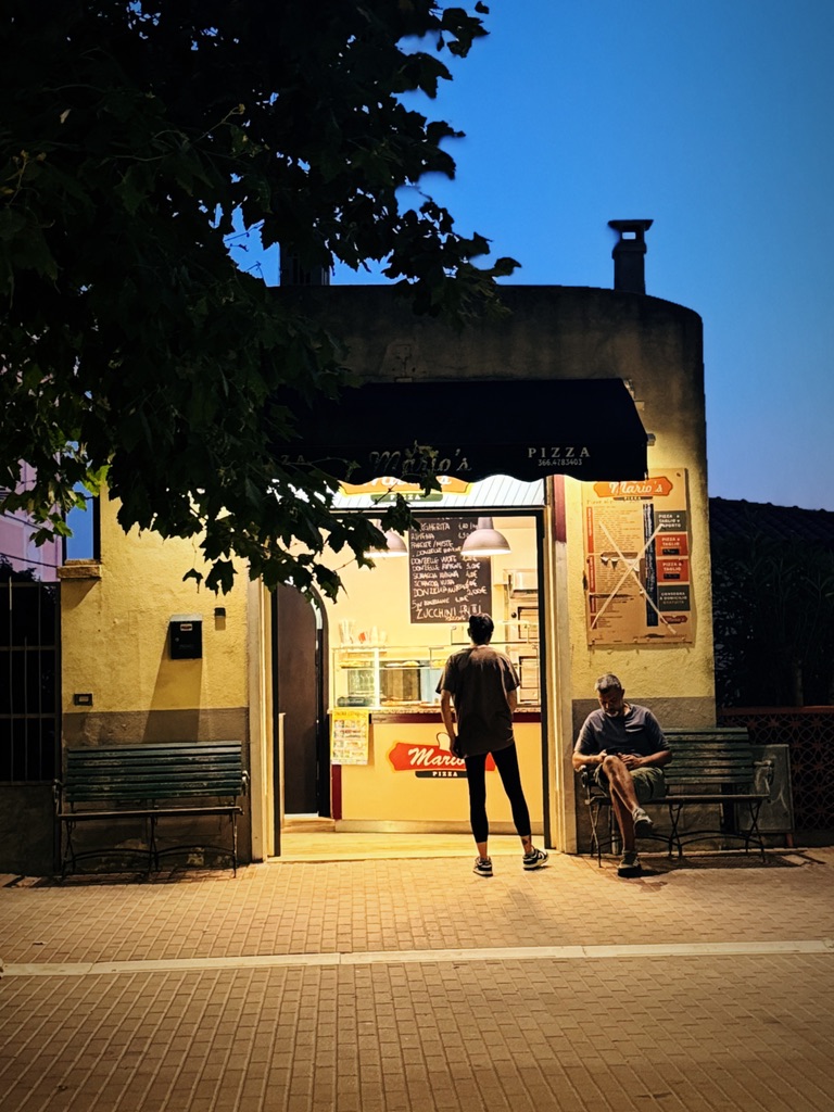
Dass der Mitarbeiter in der Pizzeria an der Strandpromenade so gut Englisch sprach, verwundert mich bis heute. Dabei hatte ich in den letzten Tagen nach den ungeahnten Ereignissen und Begegnungen mein Italienisch deutlich aufgebessert. Follonica war keine Stadt, in die man fuhr, weil man sie sehen wollte. Man fuhr hin, weil man etwas brauchte. Bargeld. Einen gut sortierten Supermarkt. Vielleicht ein Ladegerät. Die Stadt lag flach, wie ausgebreitet am Meer. Keine Höhe, kein Widerstand.
Dieser Mann – ein junger Mann mit schwarzen Locken, der hier in den Sommerferien arbeitete – bestand darauf, mit mir Englisch zu sprechen. Er nannte seinen Namen und wiederholte meinen Namen mehrfach. Freundlich und engagiert nahm er meine Bestellung auf. Nur Straßen, Ampeln, Kreisverkehre, eine Tankstelle mit überlaufen Mülleimern, ein paar uninteressante Boutiquen, ein geschlossenes Tabacchi. Und das Meer – irgendwo hinter den Gebäuden. Vielleicht war Follonica nur der Versuch einer Stadt.
Die Pizza war lecker, aber etwas lieblos belegt. Auch der Aperol Spritz war fad. Dennoch erwiderte ich beim Abräumen der Teller auf seine Frage, ob es mir geschmeckt habe, dass es sehr, sehr lecker war. Ich zahlte mit Karte, gab ein wenig Trinkgeld und ging zurück auf die Promenade, um ein bisschen zu schlendern und einen guten später ein Taxi zu suchen.
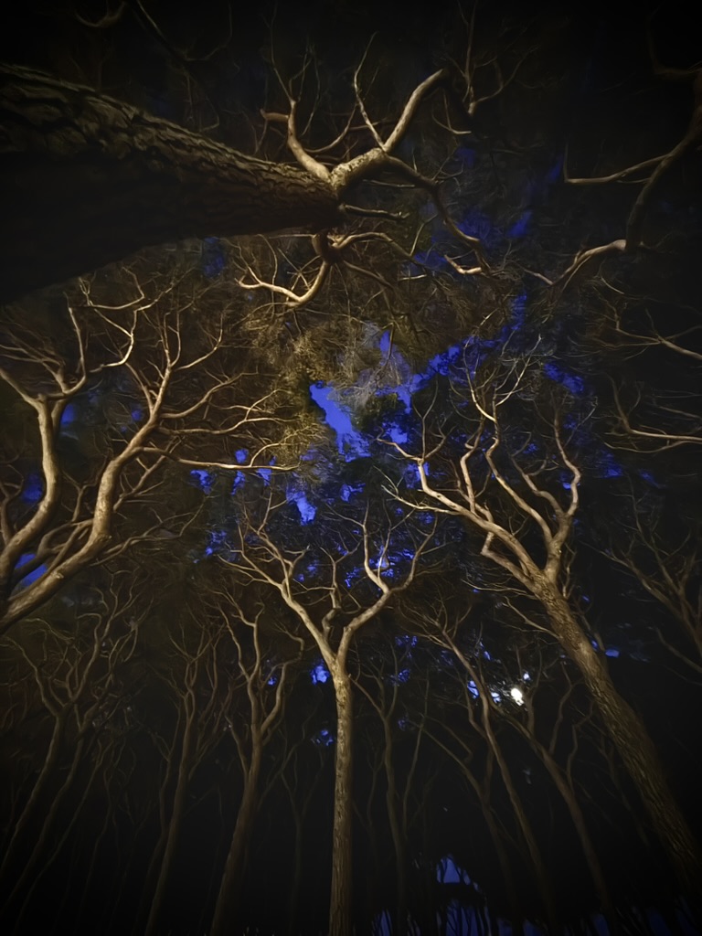
Das Licht in diesen Wäldern war nicht dramatisch. Es fiel matt durch das Geäst, wie durch einen Schleier aus kratziger Wolle. Kein italienisches Sonnenlicht im klassischen Sinn, nichts Cinematografisches – sondern ein gedämpftes, fast müdes Leuchten, wie von gewalktem Flanell, grau-grün, staubig, schweigend.
Früher glaubte ich, Banditen lebten in Höhlen. Mit Feuerstellen und Fellen und schmutzigen Fingern. „Bandite di Scarlino“ – als hätte man sich an das Bedrohliche gewöhnt. Als sei es romantischer, wenn der Wald von Räubern erzählt.
Einer, der sich in der Mittagshitze unter den Schatten eines Olivenbaums legt, das Licht über ihm: flimmernd wie ein Seidenfutter, ein flacher Wind, ein harziger Duft.
Sie waren lange vor uns da. Lange vor den Touristen, den Badematten, den Mietwagen. An den Hängen des Monte Macchia – über dem Lago dell’Accesa – liegen zahlreiche Gräber, halb vergessen. Ich war nicht dort. Hatte es mir vorgenommen, aber dann war es zu heiß.
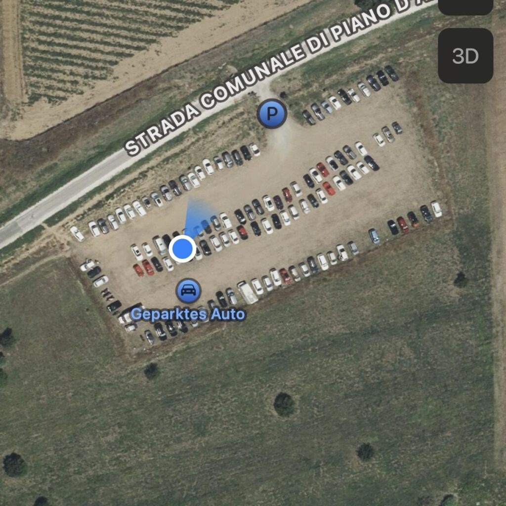
Trotzdem dachte ich daran – an sie, hier auf dem Parkplatz. An ihre Wege durch die Hügel, die Tonkrüge, die Chimäre von Arezzo. Die Männer trugen Tuniken aus Wolle oder grobem Leinen. Die Farben waren erdig, die Stoffe schwer. Die Etrusker lasen die Zukunft aus dem Flug der Vögel, der Himmel war eine Karte der Götter. Irgendwann gingen sie unter.
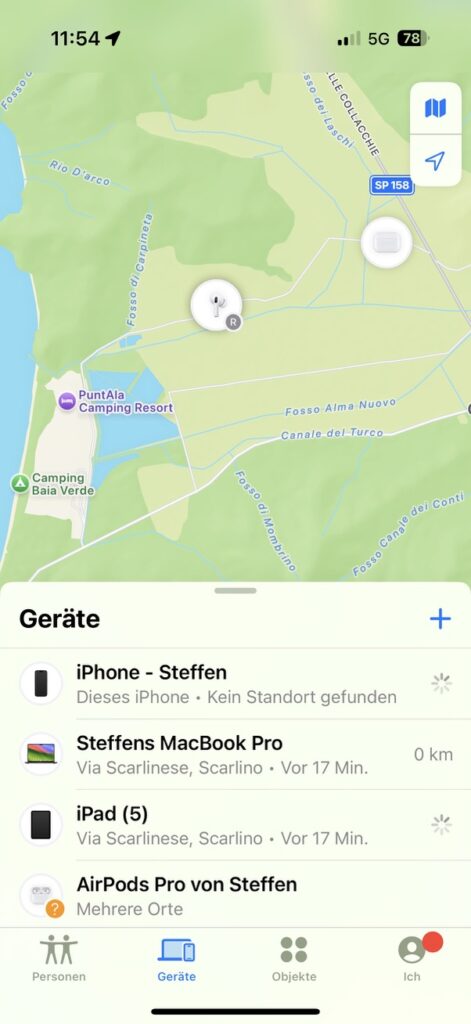
Er schlägt die Scheibe ein, leise, wie man eine Tür schließt. Und kurz darauf ist alles verschwunden.
Wahrscheinlich waren sie noch immer hier. Hier unter mir, irgendwo in der Erde. Während ich summend darüber schlenderte, mit meinem schlammbraunen Leinenhemd, den Raffia-Sandalen und der völlig überteuerten Sonnencreme. Irgendwie tröstlich.
Das Licht in diesen Wäldern war nicht dramatisch. Es fiel matt durch das Geäst, wie durch einen Schleier aus kratziger Wolle. Kein italienisches Sonnenlicht im klassischen Sinn, nichts Cinematografisches – sondern ein gedämpftes, fast müdes Leuchten, wie von gewalktem Flanell, grau-grün, staubig, schweigend.
Früher glaubte ich, Banditen lebten in Höhlen. Mit Feuerstellen und Fellen und schmutzigen Fingern. „Bandite di Scarlino“ – als hätte man sich an das Bedrohliche gewöhnt. Als sei es romantischer, wenn der Wald von Räubern erzählt. Ich ging durch diese Wälder, dachte an Räuber, die nie welche waren, und an Räuber, die es heute sind.
Ein Fahrzeug. Ein paar persönliche Dinge. Besitz ist nichts weiter ist als eine Vorstellung. Ein Glaube, so brüchig wie das Vertrauen in Schlösser.
Ich stellte mir vor, dass ein Mann damals, in der Zeit der echten Banditen, in diesem Wald Schutz gesucht hatte.
Mit einem gestohlenen Esel. Vielleicht mit einer Pistole im Gürtel. Mit Hunger? Und dann legte ich mich ins Gras und hörte, wie es unter mir knisterte.
Lorella war eine lustige ältere, sympathische, grauhaarige Frau. Im Alltag, auf der Straße, irgendwo im Supermarkt, wäre sie mir nicht besonders aufgefallen. Ihre Kleidung könnte ich jetzt – lange nach den Vorfällen – gar nicht genauer beschreiben. Doch müsste ich es, würde sich das ungefähr so anhören: Ein einfarbiges Oberteil, vermutlich langärmelig, und eine lange Hose, beides in Schwarz, Grau oder Dunkelblau. Keine Ahnung. Am Oberteil erinnere ich einen gehäkelten Ansatz, eine Art Spitze – aber sehr grob. Ihre Frisur: graues, halblanges Haar. Die Schuhe: Halbschuhe, grau oder schwarz, aus Leder. Alles ziemlich nichts sagend. Doch Lorella redete gerne und viel. Natürlich auf Italienisch.
Sie sagte immer freundliche Dinge, wie: „Kein Problem“, oder: „Das ist kostenlos“, oder: „Sie sind mein Gast“ – und natürlich:
„Allora“
Ich war zufällig an sie geraten, über eine Onlineplattform, und hatte bei ihr eine Ferienwohnung gemietet.
In ihrem Kühlschrank, gleich hinter der Rezeption, lagerte sie mehrere italienische Biersorten. Das Licht darin war kein Licht im eigentlichen Sinn, sondern eine Art kränkliches Leuchten, hier hatte sich jemand bemüht, die Kälte selbst sichtbar zu machen.
Direkt sympathisch fand ich ein Peroni mit rotem Etikett – ein Dreiviertelliter italienisches Bier. Ein beeindruckendes Format. So kalt, dass man es sich am liebsten direkt gegen die Stirn drücken wollte, um die Gedanken zu beruhigen, die in dieser Hitze nur noch kreisten. Ein Dreiviertelliter – das trinkt man nicht einfach mal „by the way“.
Die Waschmaschine war frei, ebenso das Klopapier. Das Bier würde sicherlich auf der Endabrechnung landen. Die Mülleimer lagen in Sichtweite meines Balkons. Die benachbarten Balkone der anderen Urlauber waren mir etwas zu nah, aber ich rauchte dennoch einen Joint, leerte die Reste des Biers und führte unentwegt Telefongespräche. Eigentlich war ich im Urlaub, aber das hier – das sollte wirklich in Arbeit ausarten.
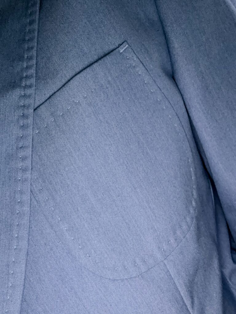
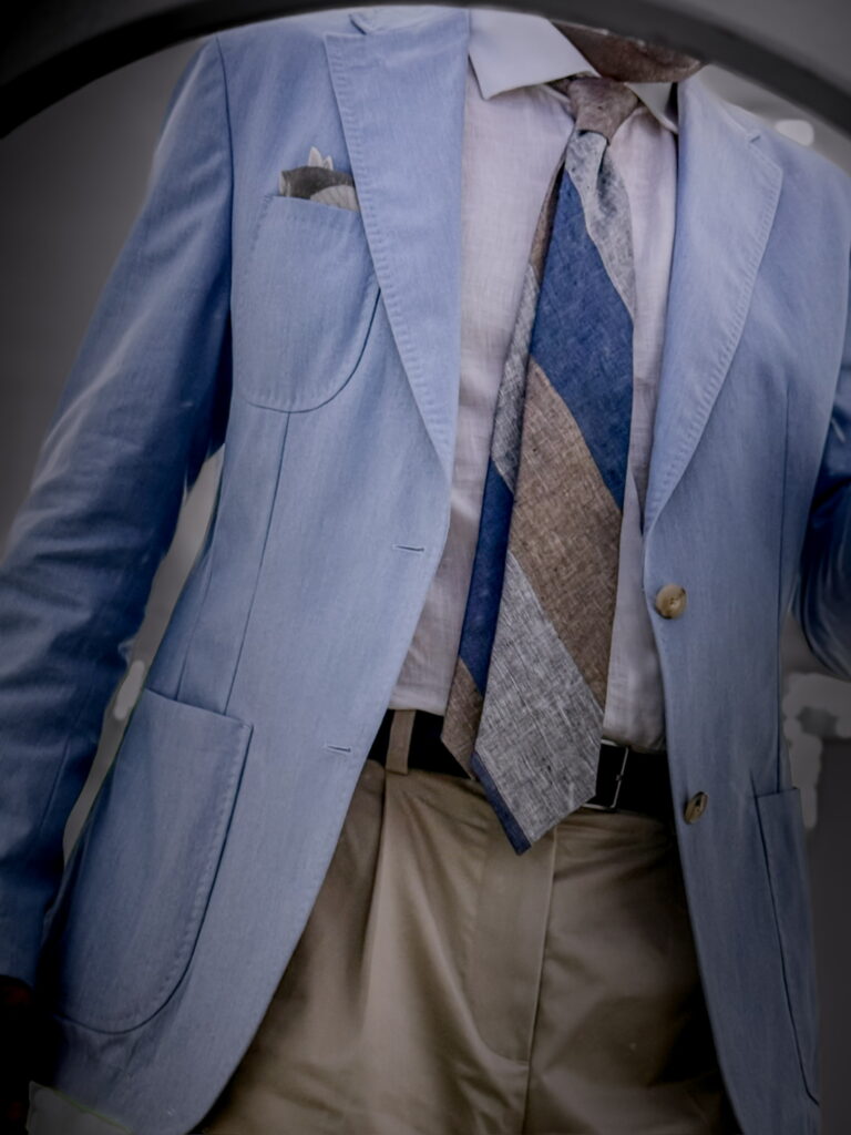
The composition operates through controlled temperature contrast. The light blue jacket establishes a cool, high-reflection surface that visually advances. It becomes the dominant element not through saturation, but through luminosity.
Stylistically, the look sits within a softened tailoring framework. Patch pockets and cotton construction reduce formality, while the tie preserves a structured visual axis.
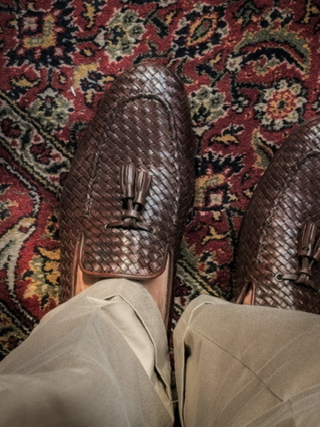
In contrast, the khaki trousers and brown woven leather shoes function as absorptive bases. Their warmer temperature and lower reflectivity anchor the composition, preventing upward visual drift.
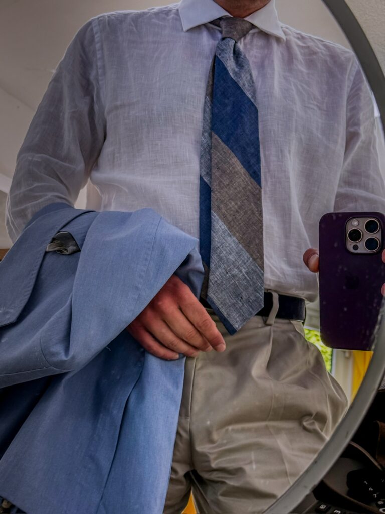
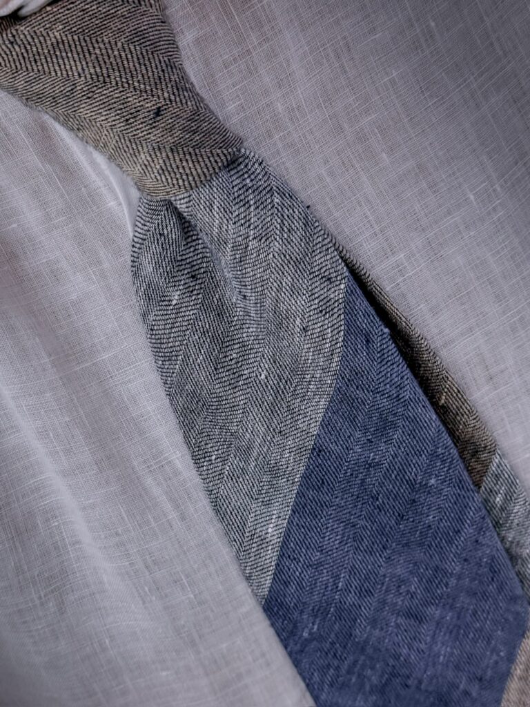
The tie acts as a transitional device. Its segmented structure—blue, beige, grey—creates chromatic continuity rather than interruption. This aligns with principles of color interaction, where adjacency softens contrast perception.
Material coherence reinforces this balance. Cotton twill, smooth shirting, and the slightly coarse tie maintain a matte, light-diffusing surface behavior. The woven leather introduces micro-structure without disrupting the overall visual quietness. The result is not contrast as opposition, but as modulation within a narrow tonal field.
The shoes: brown tassel loafers, woven leather, light and airy. The pants: khaki, pleated, high-waisted. The shirt: white linen, see-through in the light. The tie: coarsely woven, striped in blue, gray, and beige. The jacket: light blue, summer fabric, soft shoulders.
Der Hut: ein Stetson Panama, aus Stroh, handgeflochten irgendwo in Ecuador. Leicht, widerstandsfähig, praktisch. Das Hemd: Safari-Schnitt, Leinen in Anthrazit. Kühlt, trocknet schnell, zerknittert würdevoll. Stoff für Hitze und Bewegung. Die Shorts: Eine kurze Hose von H&M, beige, mit Bundfalte. Billig, aber brauchbar. Die Sandalen: Birkenstock in Gold. Deutsche Ikone zwischen Orthopädie und Alltag. Unprätentiös, robust. In der Hand: Aperol Spritz, Plastikbecher. Nichts Feierliches, nur ein Getränk.
The hat: a Stetson Panama, made of straw, hand-woven somewhere in Ecuador. Lightweight, durable, practical. The shirt: safari-cut, anthracite linen. Cool, dries quickly, crumples gracefully. Fabric for heat and movement. The shorts: beige H&M shorts with a pleat. Cheap, but serviceable. The sandals: gold Birkenstocks. A German icon that straddles the aisle of orthopedics and everyday wear. Unpretentious, sturdy. In hand: an Aperol Spritz, a plastic cup. Nothing festive, just a drink.
Leinen-Feldjacke (mein Lieblings-Sommerstück 2025). Hoch taillierte Fischgräthose aus Wolle von Alberto, gefunden im örtlichen Kaufhaus – genau wie das helle Baumwollhemd in Himmelblau und der dunkelbraune Wildledergürtel. Ich glaube, ich trug meine braunen Wildleder-Loafer.
Linen field jacket (my favourite summer piece of 2025). High-waisted herringbone trousers in wool by Alberto, found it in the local department store (already sold it on Vinted) – like the light cotton shirt in sky blue and the dark brown suede belt. I think i wore my brown suede loafers.
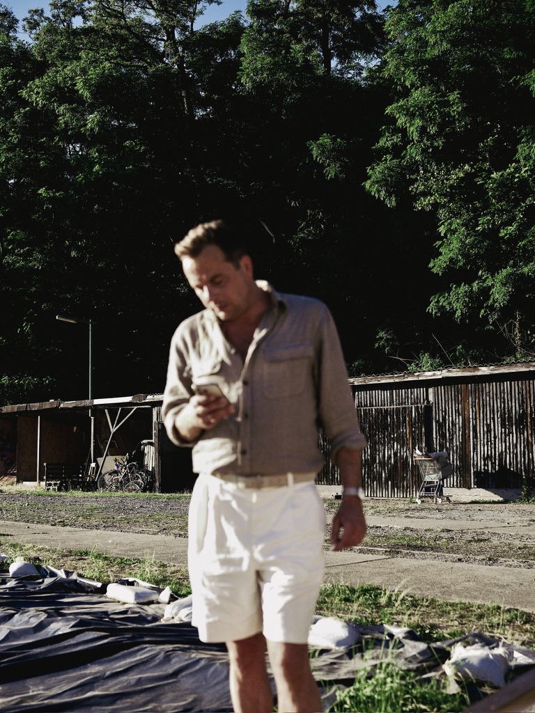
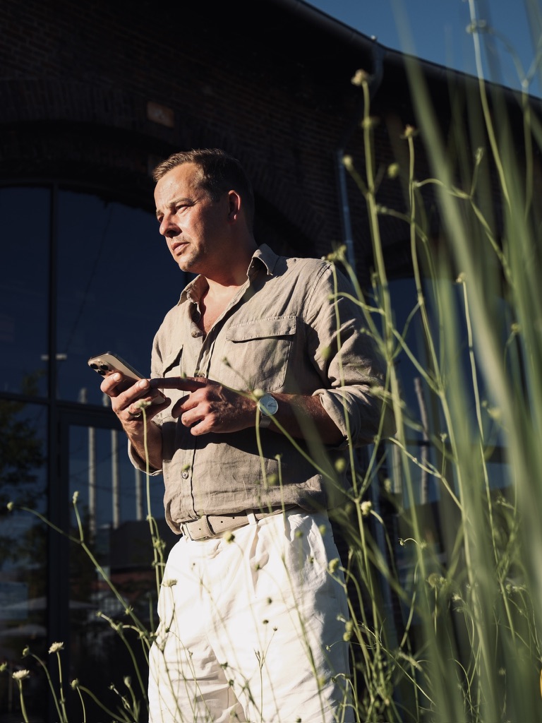
The composition is built on a narrow, warm spectrum. Beige, sand, and off-white dominate, creating minimal chromatic contrast. Instead, differentiation emerges through light intensity and surface response.
At first glance, there is almost no contrast—just variations of beige and white under direct sunlight. But the distinction comes from how the fabrics handle light.
The linen shirt absorbs light unevenly due to its fibrous structure. This creates micro-shadows and a slightly desaturated appearance. In contrast, the white trousers reflect light more directly, producing a clearer, brighter plane. This establishes a vertical gradient: darker, matte above; lighter, reflective below.
The effect elongates the silhouette without relying on sharp tonal breaks.
Stylistically, the outfit draws from utilitarian and colonial archetypes—safari shirt elements, high-waisted shorts or trousers—recontextualized in a contemporary, minimal setting. There’s also a subtle shift in formality. The shirt suggests utility, while the trousers feel more tailored. That tension remains understated, but it’s enough to keep the outfit from feeling flat.
It’s a good example of how summer dressing often relies less on color and more on surface and luminosity.
The absence of strong color contrast shifts attention toward material behavior and proportion. The result is coherence through temperature consistency, not variation.
Er sitzt schon eine ganze Weile dort, obwohl niemand gesagt hat, dass er warten soll, und draußen zieht etwas vorbei, das wie ein Fest aussieht, aber man hört nur gedämpfte Musik, als würde sie aus einem anderen Gebäude kommen. Der Hut liegt richtig, fast zu richtig, als hätte er ihn für jemanden aufgesetzt, der gar nicht auftaucht.
Field Note on Fabric: Linen, Tropical Wool and Straw
Material defines thermal logic. The linen workshirt, with its open weave and irregular surface, allows continuous air exchange. Its creasing is structural, not incidental—evidence of fibre behaviour under heat and movement. In contrast, the trousers—lightweight worsted wool—maintain shape. Wool’s crimped fibre structure regulates temperature, absorbing moisture vapour while preserving a dry hand feel. This creates stability in the lower half, both visually and physically.
The Panama hat, woven from straw, functions as a rigid yet breathable shell. It reflects direct sunlight while maintaining internal airflow, acting as a climatic interface rather than a decorative element.
The colour structure is horizontal rather than hierarchical. Transitions are gradual, defined by proximity rather than contrast.
Field Note on Occasion: Heat and Interruption
This is clothing for pauses rather than events. A moment outside, between interiors. The workshirt suggests utility, but without urgency. The wool trousers retain a trace of formality, preventing the look from collapsing into pure leisure. The sandals remove any residual tension. No transition layer remains between body and environment.
Er sitzt im Schatten eines zu kleinen Baumes, das Hemd offen am Hals, das Telefon in der Hand, als würde gleich noch etwas passieren, obwohl alle längst gegangen sind.
Surface behaviour and summer structure – controlled exposure
The system balances exposure and structure. Open collar, bare ankles, uncovered hands—offset by the defined line of the trousers and the architectural clarity of the hat. Nothing is accidental, but nothing appears fixed.